
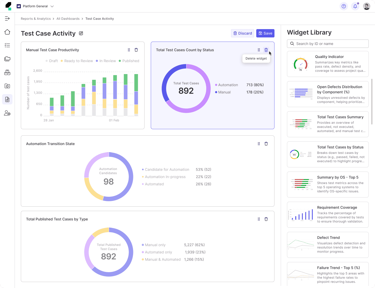
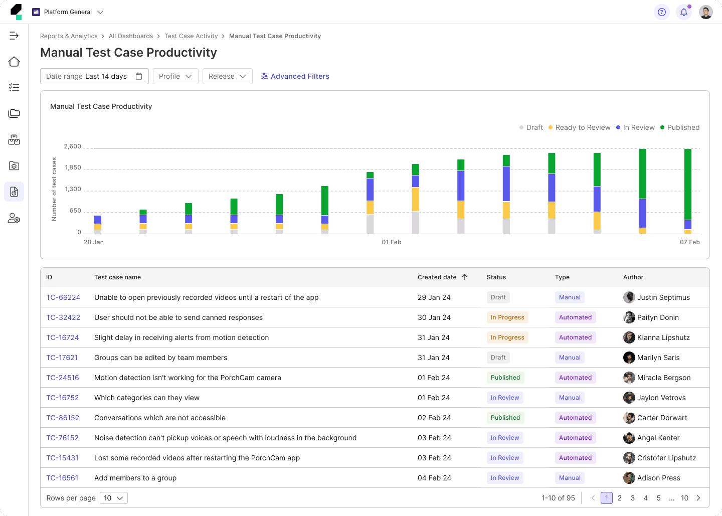
Overview
As part of the TestOps Gen 3 re-direction, our team was tasked with re-evaluating and rebuilding the Design System V2 from Design Foundations to Components, Patterns Library, which collectively formed Design System V3.
This initiative aimed to create a cohesive and scalable design system to support cross-functional teams and enhance the user experience.
Design team
1 Product Design Lead
1 Sr. Product Designer
1 Product Designer (me)
Engineering team
1 SE Lead
1 SE
Timeline
Nov, 23 - Nov, 24
My Contribution
As a Design System Designer, I played a key role in defining the visual styles, establishing design tokens, and creating component library to ensure a cohesive and scalable design system.
I documented design guidelines to provide clear usage instructions for designers and developers.
Additionally, I conducted testing on component behavior and interactions to verify their functionality across different use cases, ensuring consistency and usability throughout the product.
I worked independently with developers to ensure seamless deployment, collaborating closely to address technical challenges and maintain the integrity of the design.
Design Process
Build the Design Foundation
The Design Foundations serve as the backbone of the Design System, ensuring consistency, scalability, and alignment with the product's overall visual direction.
Visual Direction
The visual direction was crafted to align with the brand's personality—Sincere, Practical, and Innovative. It serves as the guiding principle for all design decisions, ensuring that every component and interaction reflects the product's core values. This included defining the tone, style, and overall aesthetics to create a Clean, Accessible, and Dynamic look.
Color
The color system was redefined to provide clarity and scalability. Accessibility was our priority, with all colors meeting WCAG contrast standards.
Blue
The core brand color, signifying trust and innovation, ideal for primary CTAs, links, and highlights.
Blue Light
Based on brand blue, use for the case that need to apply brand blue for background, but less contract.
Blue Alpha
Based on brand blue, use for the case that need to apply the hue of brand blue.
Background Light
A soft backdrop that ensures primary and secondary colors pop effectively.
Background Dark
A soft backdrop that ensures primary and secondary colors pop effectively.
Text Dark
Dark enough for high readability, used for main text and critical content.
Text Light
This color is significantly lighter, designed to stand out on darker backgrounds without causing strain or losing legibility.
Stroke
Delineates UI elements subtly, supporting spatial clarity and focus.
Gray Alpha
Based on content dark, use for the case that need to apply the hue of content dark.
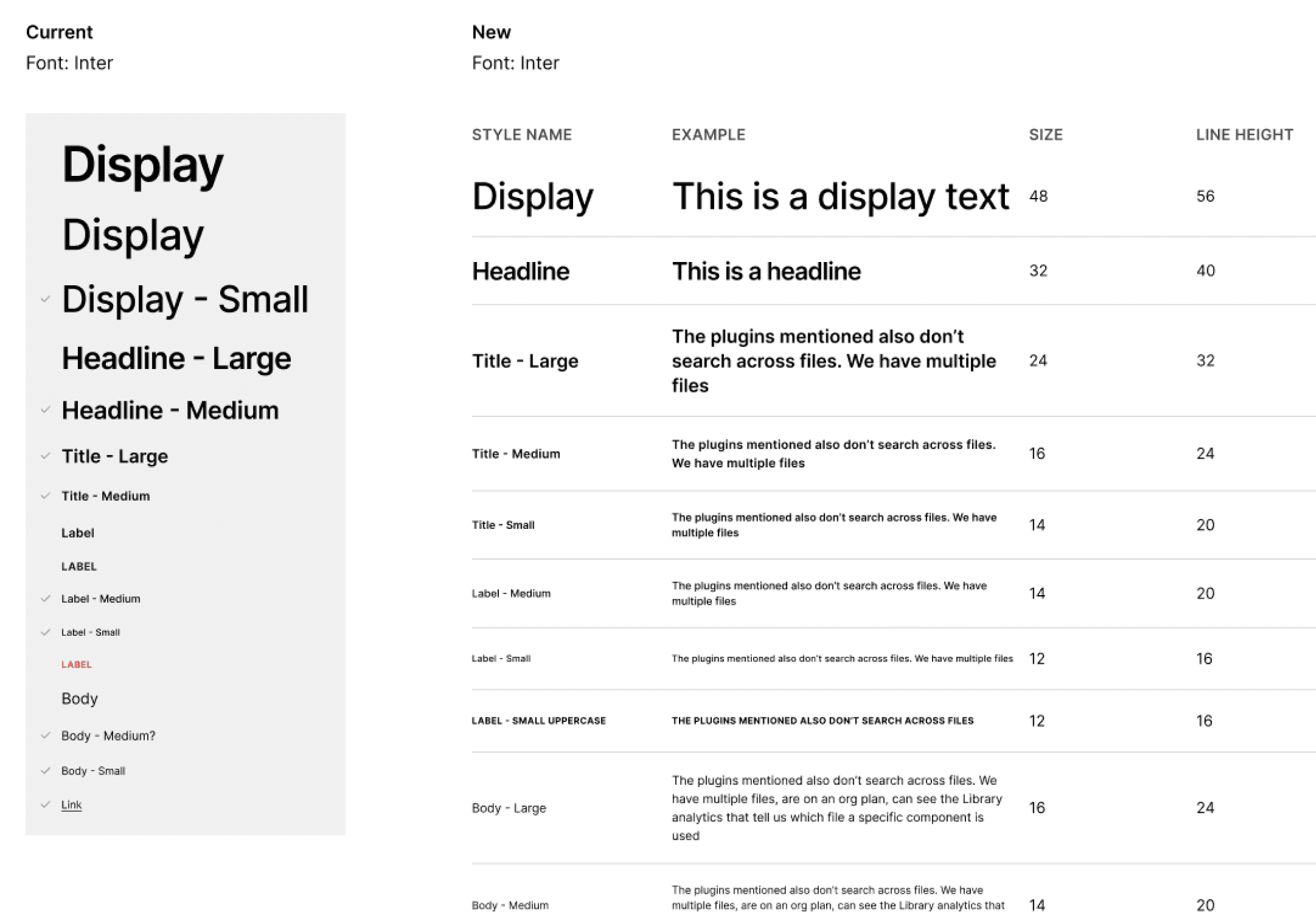
Typography
Typography was crafted to prioritize readability and establish a clear hierarchy throughout the product, ensuring consistency while remaining flexible for diverse use cases and screen sizes.
Icons and Grid System
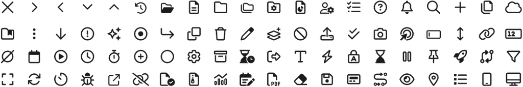
Icons: We standardized our iconography using Font Awesome, making it easy to implement by simply entering the icon name or code.
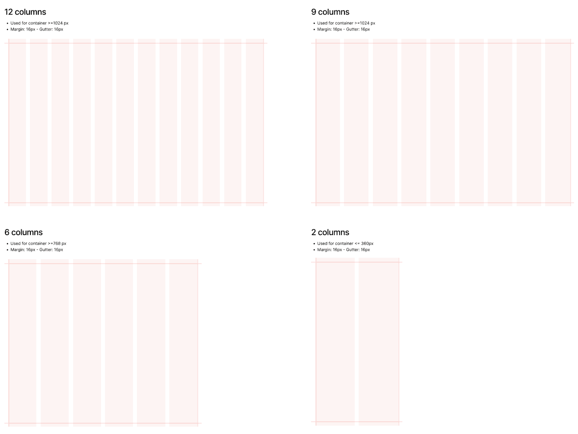
Grid System: We use a 12, 9, 6, and 2-column grid layout across different breakpoints to ensure flexibility and consistency.
Shadow and Spacing
Shadow: We defined four levels of shadow to create depth and hierarchy across the interface. Each level is designed for different use cases, ensuring a clear visual distinction between elements while maintaining a clean and modern aesthetic.
Spacing: Our spacing system follows a consistent 8-pixel base unit, ensuring alignment, readability, and a balanced layout.
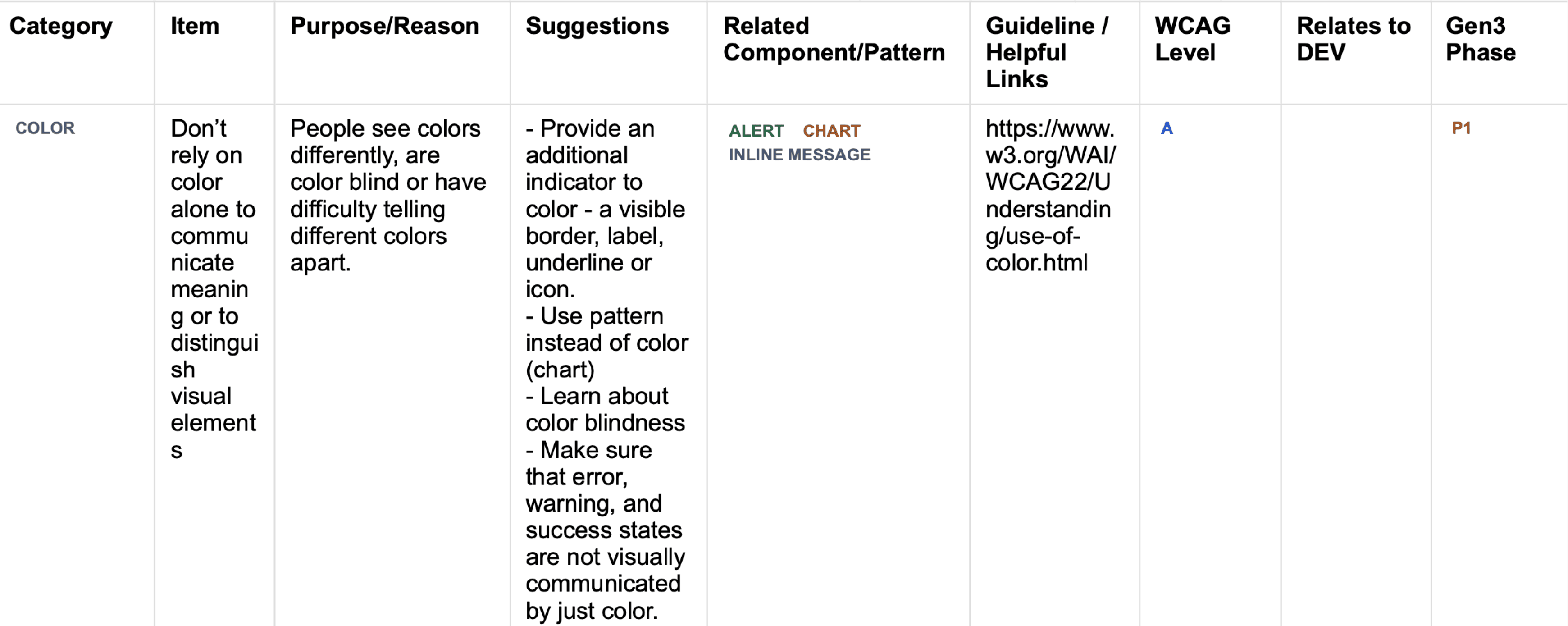
Accessibility
To ensure our designs are inclusive and accessible, we created a WCAG Compliance Document as a reference for all designers. This document outlines best practices and guidelines to help designers meet WCAG Level A and AA standards, ensuring our product is usable for a wider range of users, including those with disabilities.
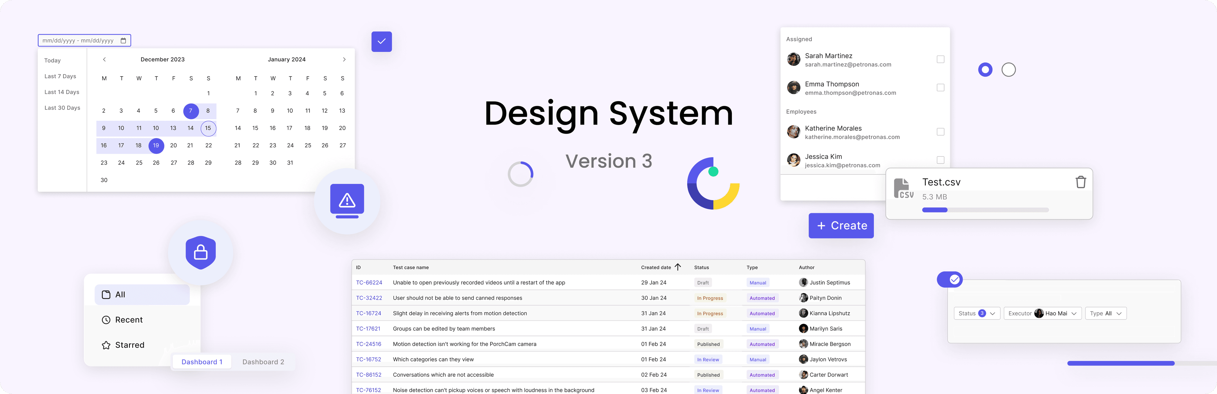
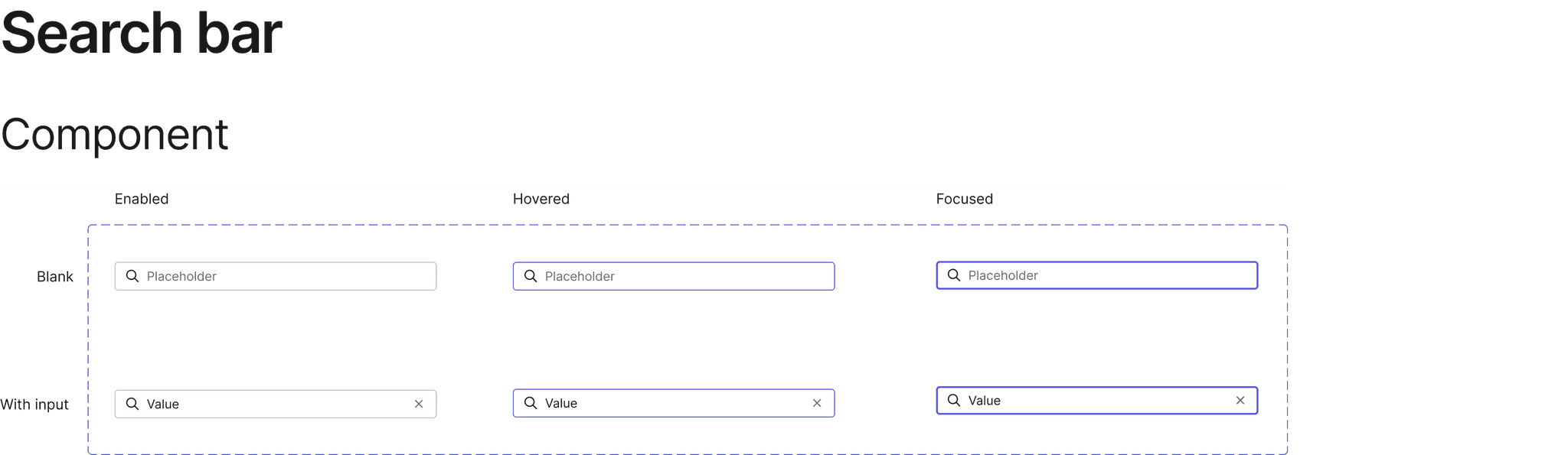
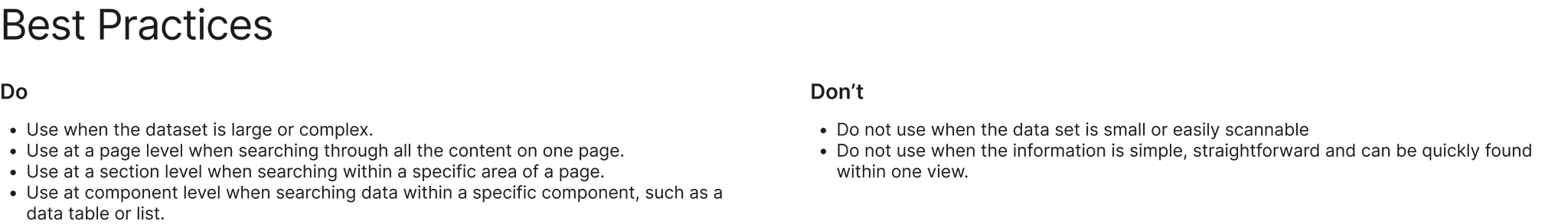
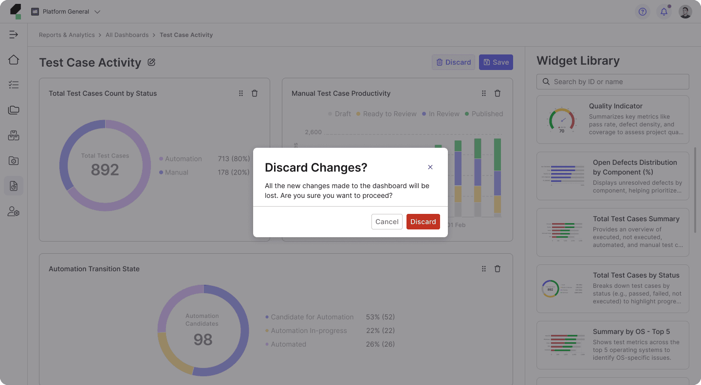
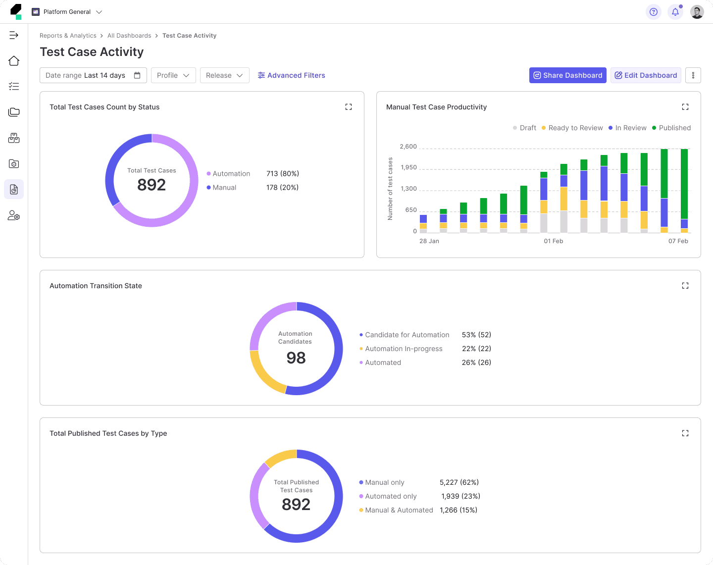
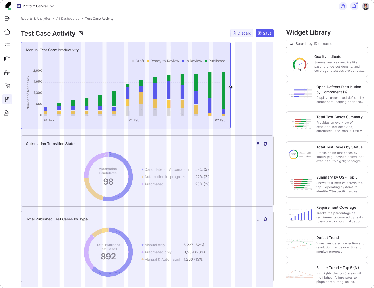
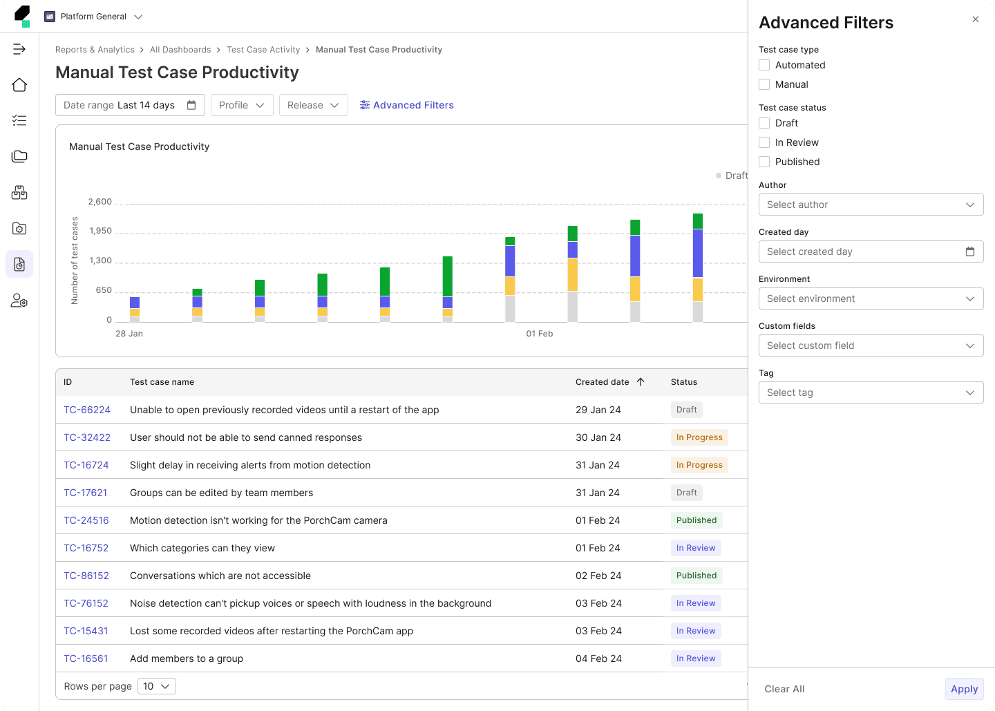
This example showcases how I gathered Search Bar use cases to understand where and how it is used in TestOps. The goal was to ensure the component meets the needs of various teams while maintaining consistency across the product.
Design Tokens
Design tokens act as the bridge between design and development, translating visual styles into reusable, code-compatible values. Collaborating closely with developers, we defined tokens for key elements such as colors, typography, spacing, and shadows. These tokens were systematically integrated into the front-end codebase, ensuring consistency across the product while enhancing scalability and maintainability. By establishing tokens as the single source of truth, we streamlined the handoff process and simplified future updates.
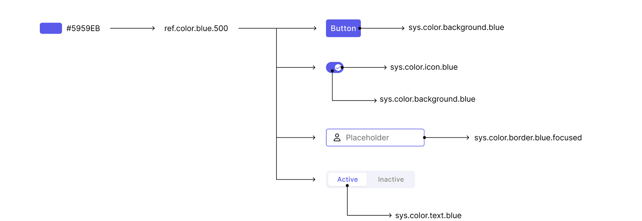
This example demonstrates how color values are mapped to reference tokens, which are then assigned to multiple system tokens.
Component Library
1. Audit the Existing Product
Audit & Mark Priority: We conducted an audit of the existing components on the TestOps platform to identify the most frequently used and crucial ones. After assessing their importance, we ranked them by priority. The components were then categorized into two groups: Atomic and Composite. Components in the Atomic - High Importance and Composite - High Importance groups were assigned the highest priority for development and refinement at the time.
Button
Menu
Breadcrumbs
Date Picker
Alert
Snackbar
Tooltip
Links
Progress
Popover
Divider
Radio Button
Avatar
Pagination
Switch
Checkbox
Input Field
Chip
Dialog
Table
Tree View
Tabs
Card
Uploads
List
Drawer
Inline Message
Atomic
Composite
High
Low
Collecting Use Cases: I gathered use cases for each component within TestOps to ensure the components I designed covered all possible scenarios and could be utilized effectively across teams.
This example below showcases how I gathered Search Bar use cases to understand where and how it is used in TestOps. The goal was to ensure the component meets the needs of various teams while maintaining consistency across the product.
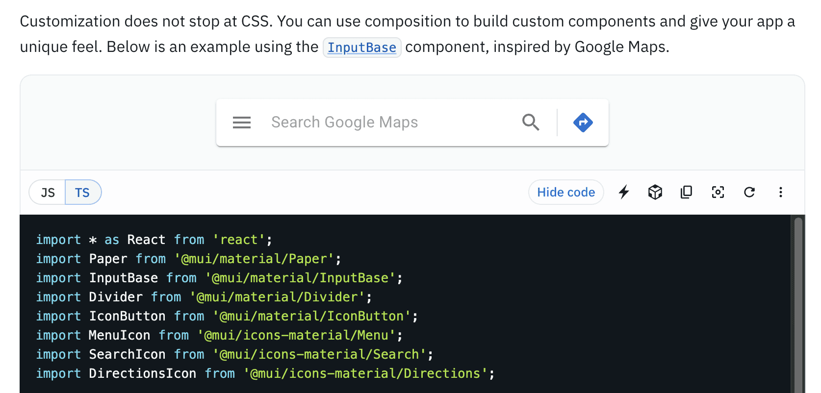
Exploring MUI Capabilities: Since our product is based on the MUI Library, I first explored the MUI documentation to understand the capabilities of the Search Bar and its implementation approach. This research helped me identify customization possibilities and framework limitations, including styling, interaction behavior, and the available API.
The example below shows how I used the MUI documentation to determine the implementation approach for the Search Bar. I discovered that the Search Bar is not a standalone component but is built using the Input or TextField component with the type="search" attribute. This means it inherits all the properties of MUI’s text input components while being optimized for search functionality, allowing for customization in styling, behavior, and interaction
2. Research other Design System
By exploring established design systems, I gained valuable insights into what works and what doesn't in terms of design principles, structure, and implementation. The design systems I referenced were:

Atlassian
A comprehensive system with well-documented components, patterns, and brand guidelines, focusing on usability and consistency across Atlassian products.
Carbon
IBM’s open-source design system, known for its modular approach, accessibility-first principles, and robust component library tailored for enterprise applications.
Material Design
Google’s design system emphasizing clarity, simplicity, and adaptability, structured around principles, components, and theming to ensure a seamless user experience across platforms.
Ideate
Component Structure and Styling: After gathering all Search Bar use cases within TestOps, I quickly sketched the initial structure to address the identified needs. I then experimented with various styles and structures to achieve the most optimal design.
Testing on Layouts: I tested the component in real layouts to ensure it functioned well across different contexts. This iterative cycle of ideation and testing continued until the design met all functional and aesthetic requirements.
Additionally, we held weekly Design System team meetings to showcase our work, share updates, and gather feedback for continuous improvement.
Test and Refine
Team Collaboration: I published the components for the design team and encouraged them to test them in their workflows.
Feedback Collection and Refinement: Based on team feedback, I refined the components to address usability issues and enhance performance.
5. Design Documentation
Comprehensive Documentation: For each component, I created detailed documentation covering specifications, behavior, usage guidelines, and best practices. This ensures consistency and effective usage by designers and developers across teams.
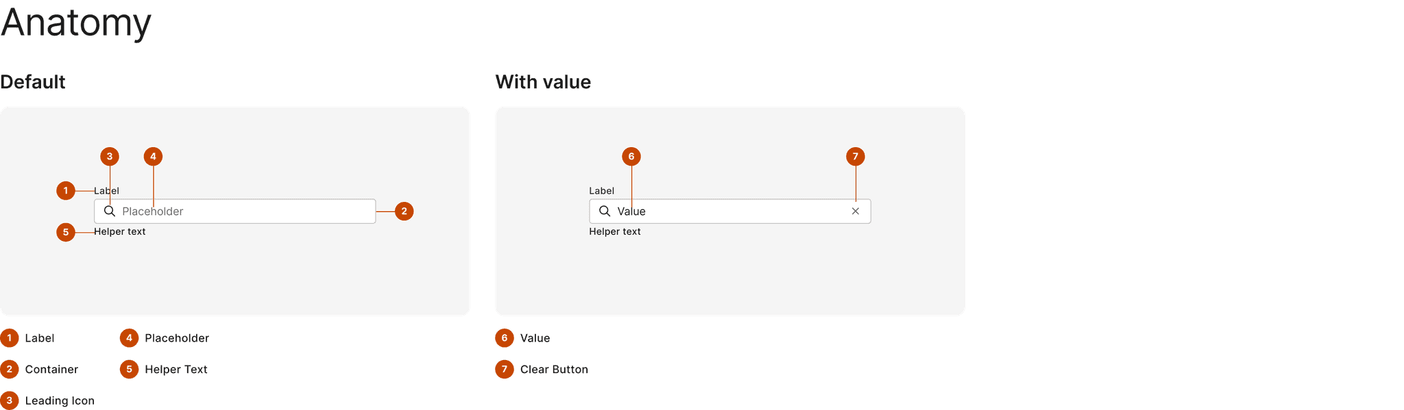
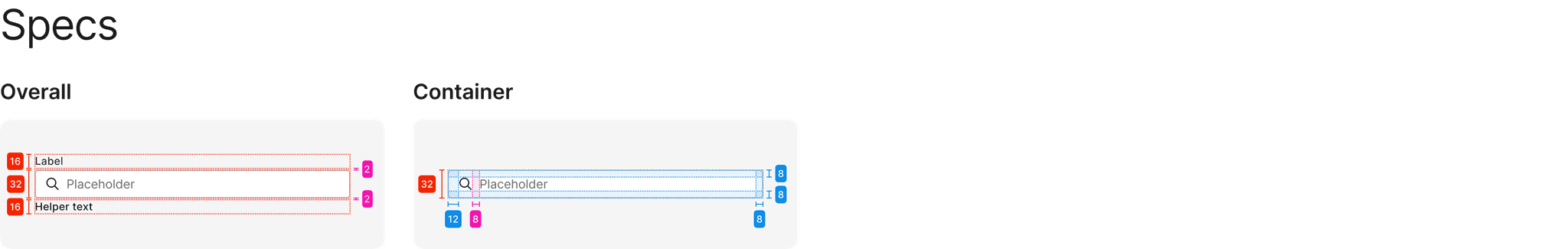
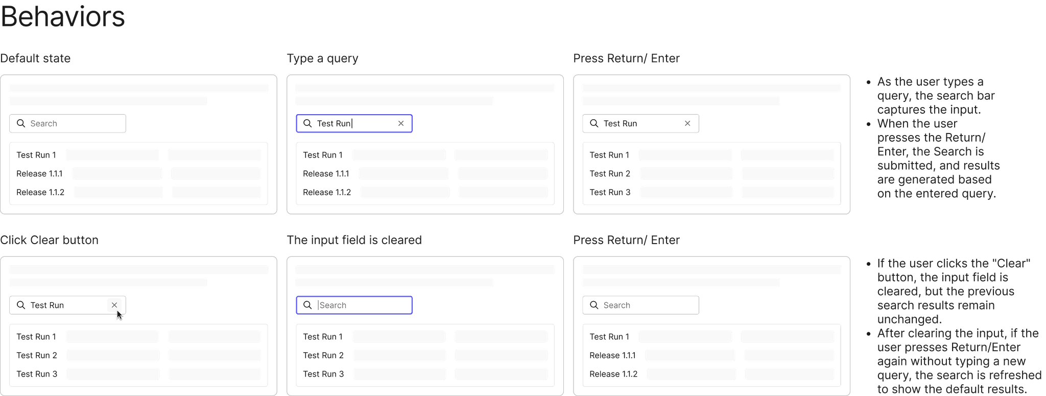
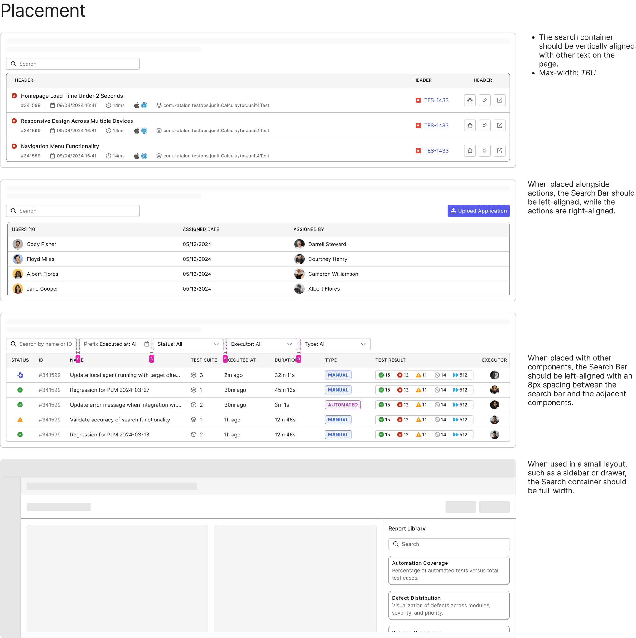
I use the Search Bar as an example, applying the same documentation approach to every component I created. This served as a guideline for designers and ensured consistency across the product.


6. Handoff and co-work with Engineers
Effective collaboration between designers and developers is key to establishing a strong foundation for the design system. By working closely together, we ensure alignment on design intentions and streamline the implementation process.
Development Handoff: Once components and design documents were finalized, I handed them off to the development team. I hosted walkthrough meetings to explain the styling, structure, and behavior in detail.
Close Collaboration: I worked closely with developers during implementation to address any discrepancies or challenges that arose.
7. Visual & Interaction Testing
After developers deployed the components in the Storybook environment, I reviewed the implementation to test both interactions and visual elements. I ensured that the components matched the design specifications and functioned as intended, providing feedback for any necessary adjustments.
8. Maintenance, Bug Fixes, and Updates
Ownership and Iteration: I maintained ownership of the components, addressing bugs and making updates as necessary to keep the design system robust and up to date.
Tools

Jira
We utilized Jira to manage the project timeline and assign tasks to the responsible team members (PICs). We created a Kanban board to track the progress of tasks and monitor the status of components, including both design and implementation phases. This tool allowed us to stay organized and ensure transparency across the team.

Zeplin
Zeplin was used as the primary tool for design handoff. It allowed me to seamlessly share finalized designs with the development team, providing them with all the necessary specifications, measurements, and assets. This facilitated a smooth collaboration by ensuring that developers had access to accurate design details and reducing the risk of miscommunication.
Storybook
Storybook was used to document and showcase the UI components in an interactive environment. It enabled the team to view components in isolation, test their behavior, and ensure consistency across different use cases. Storybook also served as a living style guide, making it easy for both designers and developers to explore and reuse components effectively.
Reflection
This was my first experience as a Design System designer, and everything felt new to me at the beginning. Throughout my journey of building the Design System at Katalon, I encountered both challenges and growth. Although it was a process of constant learning, I emerged with significantly more knowledge and skills than when I started.
The Design System is never truly complete; it's an ongoing cycle that will continue to iterate and evolve in the future.

Xuan Hao Mai - Product Designer