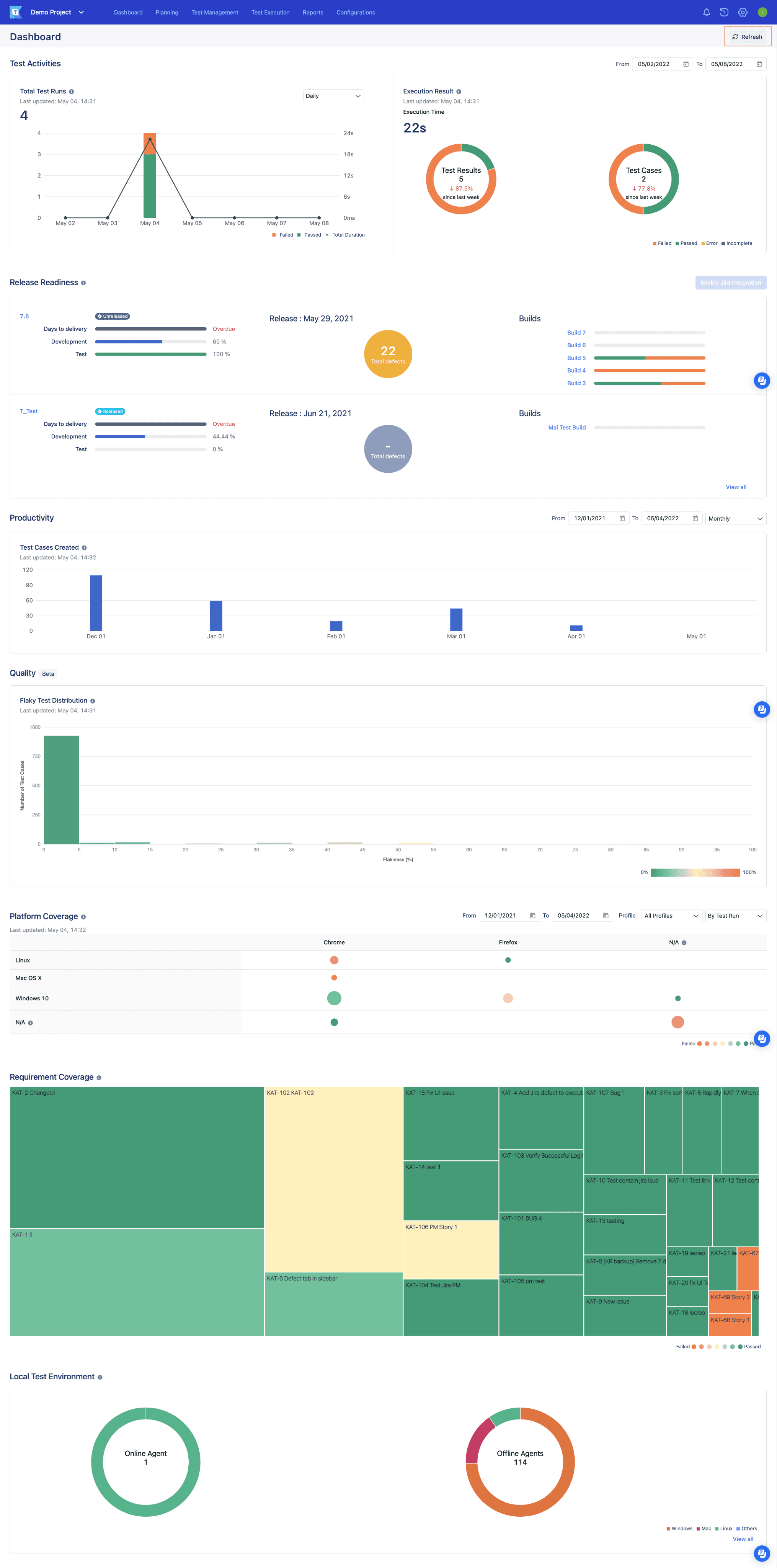
Introduction to TestOps Dashboard
In software testing environments, users rely on dashboards to derive actionable insights into testing progress, identify issues, and make data-informed decisions.
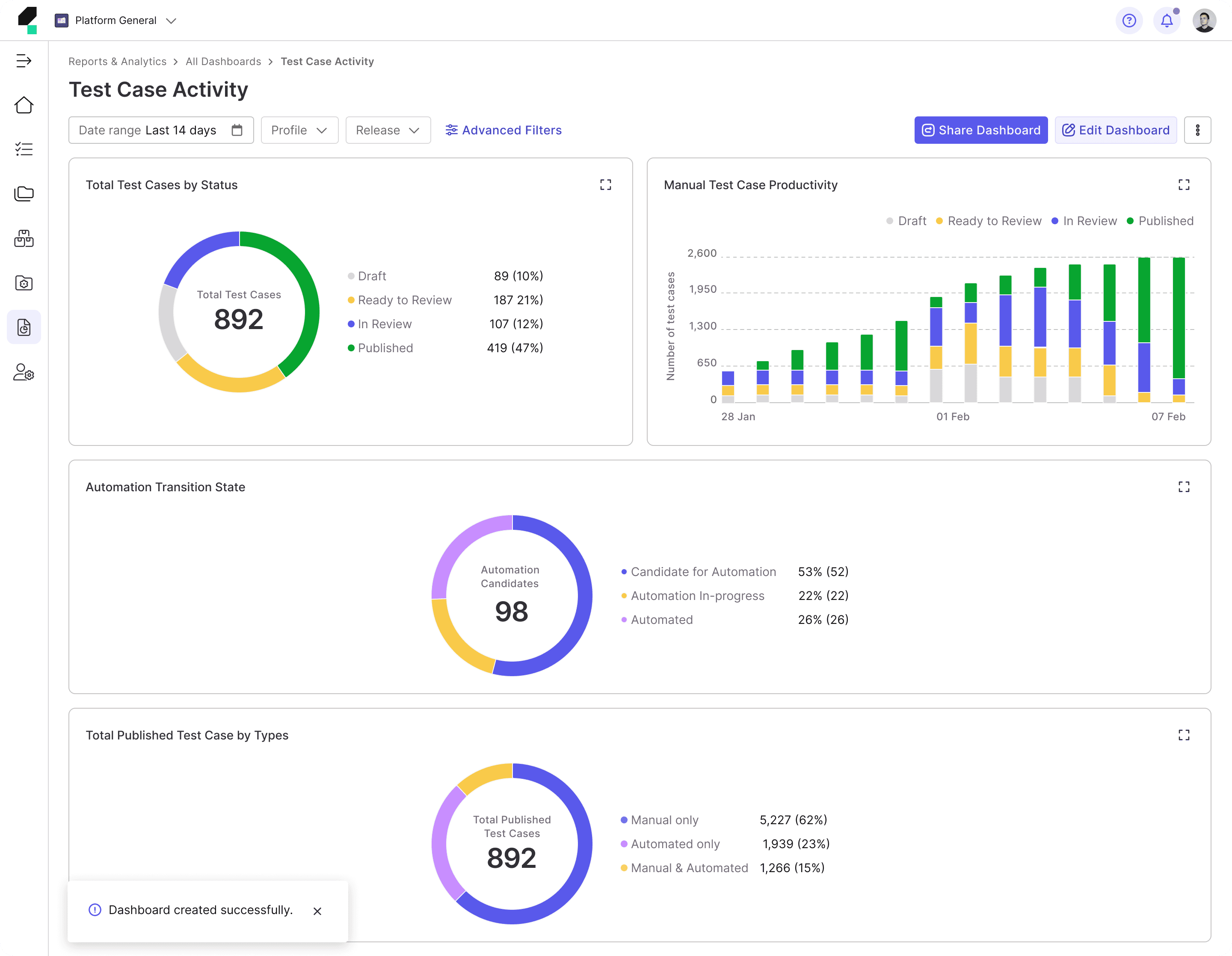
The TestOps Dashboard serves as a centralized hub, offering a quick snapshot of key metrics to keep users informed about their testing performance. With real-time data on testing activities, it provides a high-level overview while detailed reports enable deeper analysis.
Background
At the time, our product shifted its focus to target enterprise users, particularly large organizations in need of a comprehensive testing solution. This strategic pivot required a complete transformation of the product to enhance the efficiency of testing workflows—resulting in what we call TestOps Gen 3.
To align with this new direction, we undertook a re-evaluation of all product modules and initiated a redesign of the entire TestOps Gen 2 platform to meet the needs of enterprise users more effectively.
As part of this broader redesign initiative, the Reports team is also undergoing a transformation journey, beginning with a thorough assessment of the current Dashboard to identify challenges and areas for improvement.
Problems with the Existing Dashboard
Through collaborative brainstorming and discussions with Product Managers, Engineers, and Quality Engineers (QEs)—our target users—we identified several key issues with the existing Gen 2 Dashboard.
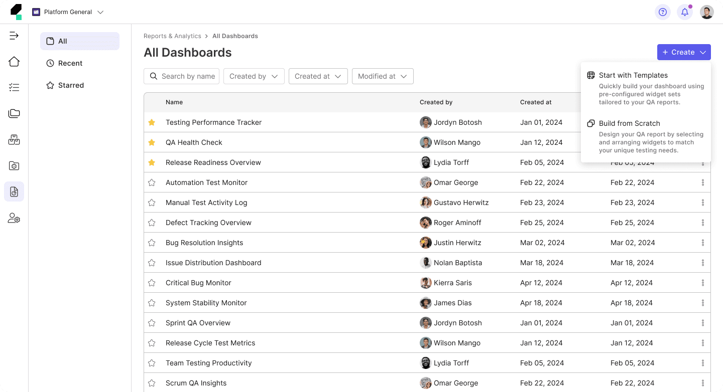
Previously, the Gen 2 Dashboard was primarily tailored to:
• Individuals or small teams, often new to automation testing.
• Users without complex integration needs or advanced feature requirements.
• Testers seeking a lightweight tool that is easy to learn, quick to use, and requires minimal investment.
Now, the Gen 3 Dashboard primarily focuses on:
• Large enterprises and organizations with scalable needs.
• Teams with professional QA engineers, test engineers, DevOps specialists, and managers.
• Complex testing workflows requiring seamless integration with multiple tools and systems.
• The need for in-depth reporting to improve software quality and streamline decision-making.
Key Problems
This results in the following key problems:
1
Lack of Flexibility and Cohesiveness
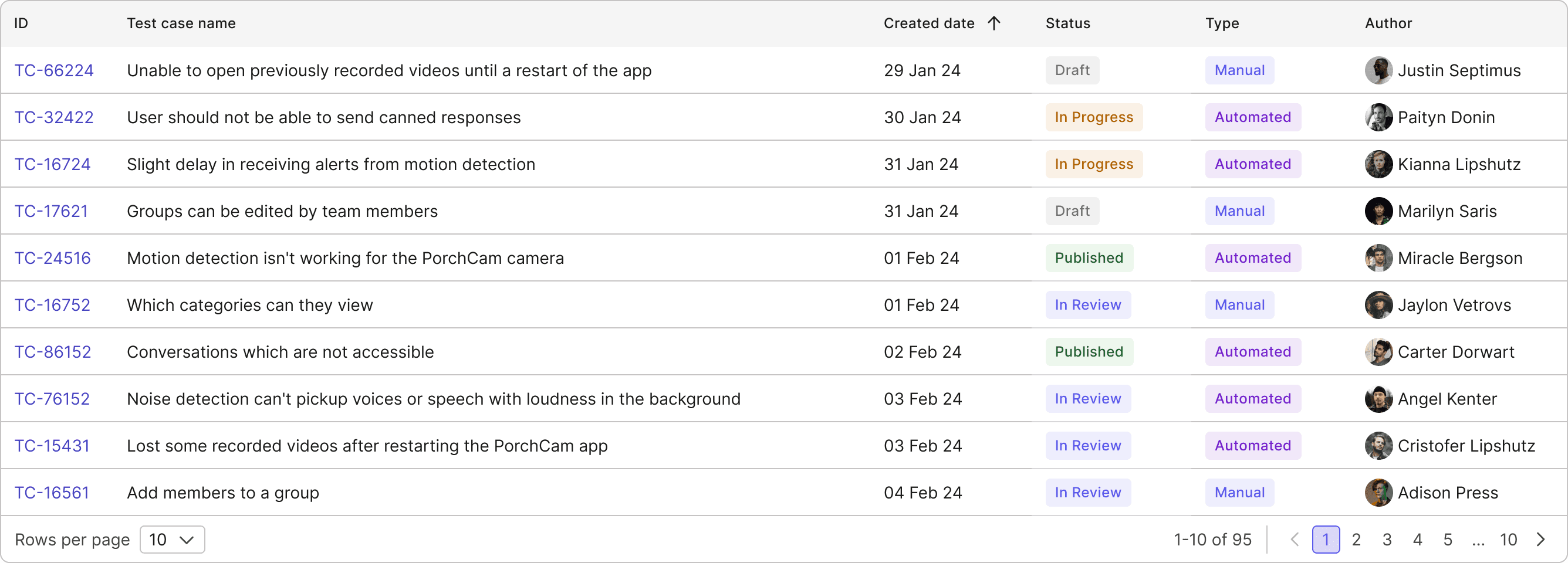
The current dashboards lack the flexibility to accommodate these needs, forcing users to spend unnecessary time filtering and navigating through irrelevant data. Additionally, the charts on the dashboard function independently, offering no visual connection or cohesive context, which limits users' ability to derive actionable insights. All of these lead to inefficiency, confusion, and difficulty in prioritizing tasks.
• QE Leads struggle to get a quick, high-level overview of test performance and have difficulty tracking team progress across multiple projects.
• QEs find it difficult to focus on their tasks without being overwhelmed by unrelated metrics.
2
Inability to View Multiple Dashboard
The current dashboard also lacks the ability to offer personalized views that cater to the different needs of users at various stages of the testing process.
• QE Leads have to manually adjust the dashboard each time to view different aspects of the testing process (e.g., sprint progress, release health, or defect trends). They are forced to recreate views or reconfigure the dashboard when needing to track cross-team performance summaries.
• QEs must repeatedly reapply filters every time they want to focus on specific tasks, such as reviewing test results for particular test cases, focusing on failed tests, or tracking test execution progress.
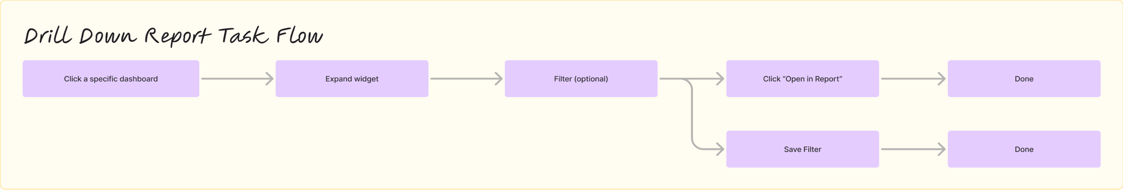
3
Restricted Data Exploration
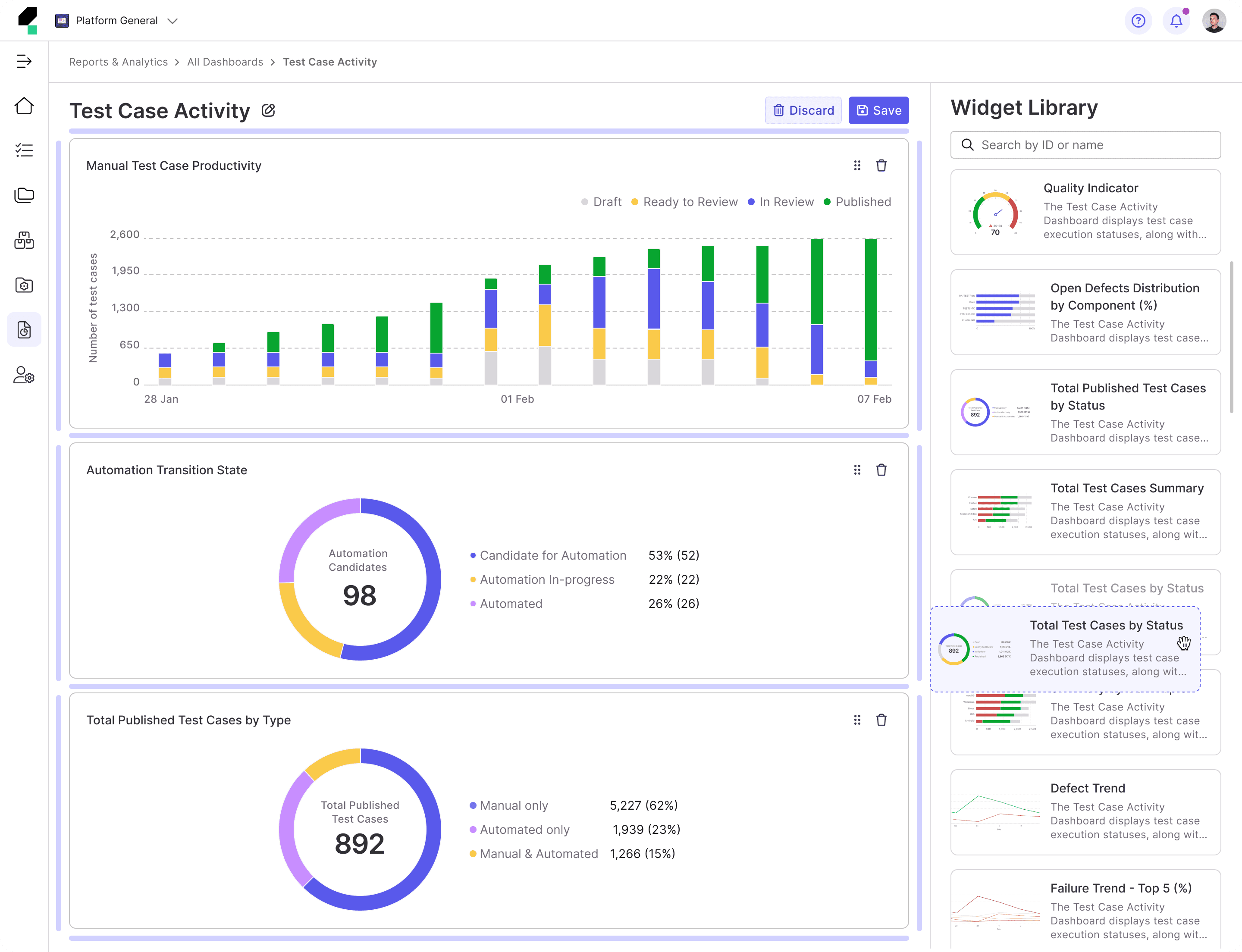
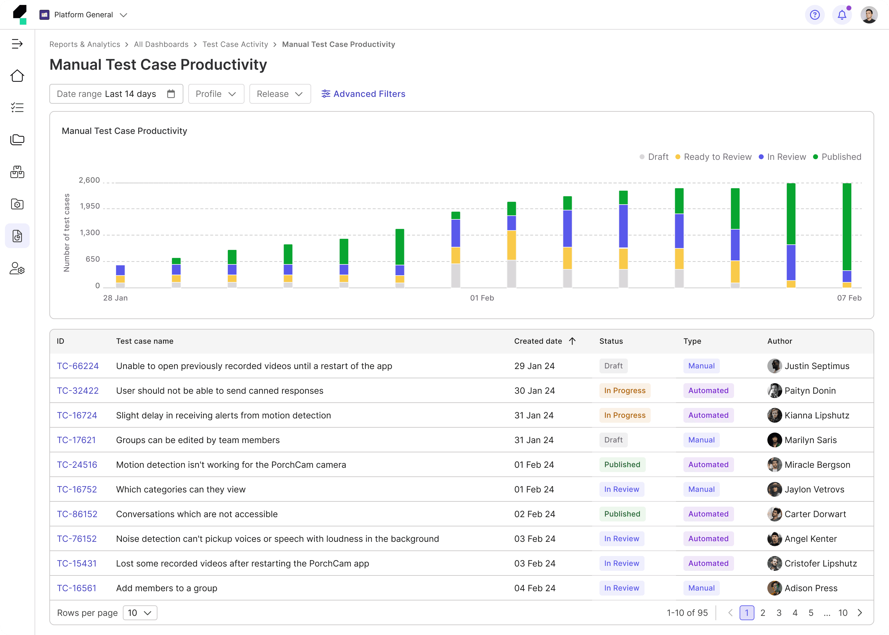
The lack of drill-down capabilities restricts users from uncovering deeper insights.
• QE Leads cannot efficiently analyze root causes or trends across test executions and defects.
• QEs are unable to explore detailed test results or identify patterns that could inform improvements.
Emerging Opportunity
How can we design a fully customizable dashboard that provides enterprise users the flexibility to tailor their view based on preferences, while offering a seamless drill-down experience for deeper insights?
Design Process
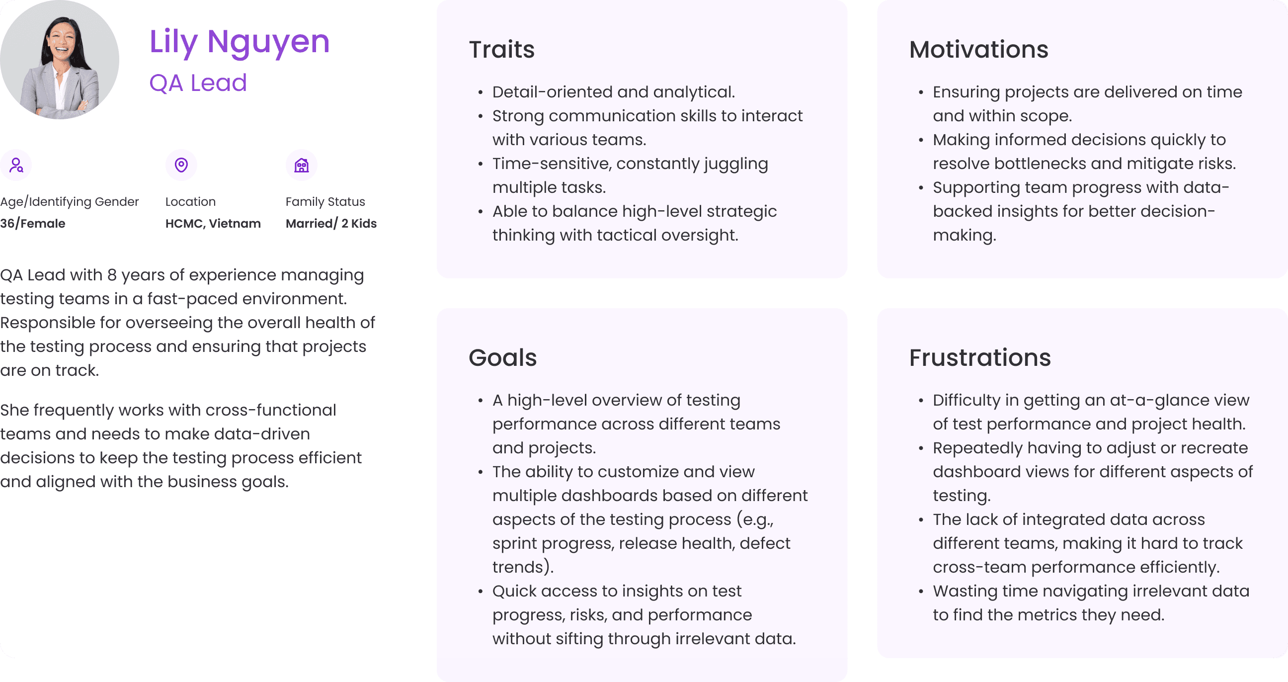
Proto Personas
At the time, my team was under significant pressure to meet a tight deadline for the Beta release. Everyone across multiple teams, including myself, had to work efficiently, making thoughtful trade-offs and prioritizing essential tasks. Given these constraints, we decided to forgo extensive user interviews at that phase. Instead, I gathered user insights by consulting with Product Managers and our internal Quality Engineers.
Using the insights collected, I created Proto Personas to provide the team with a clear understanding of our target users. These Proto Personas helped us stay focused on user needs and align our efforts throughout the project.

Competitor Analysis
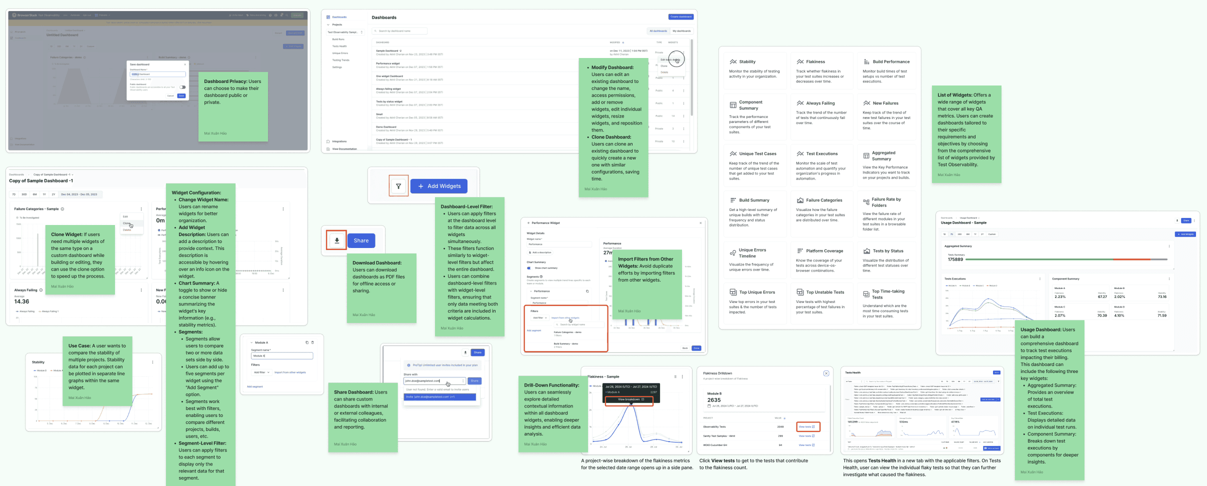
I conducted a competitor analysis to compare the building a custom dashboard experience of the current testing tools, understand the current practices, identify weaknesses or strong points, and see how Katalon can improve and do better on top of what’s already been done.

Jira XRay
Direct Competitor
A Jira-integrated test management tool for managing manual and automated tests with CI/CD support and robust reporting.

LambdaTest
Direct Competitor
A cloud-based cross-browser testing platform offering parallel testing, debugging, and detailed reports.

BrowserStack Observability
Direct Competitor
A tool combining cross-browser testing with performance monitoring to quickly resolve application issues.

GitLab
Indirect Competitor
A DevOps platform with testing features like pipeline-driven execution and code quality reports.
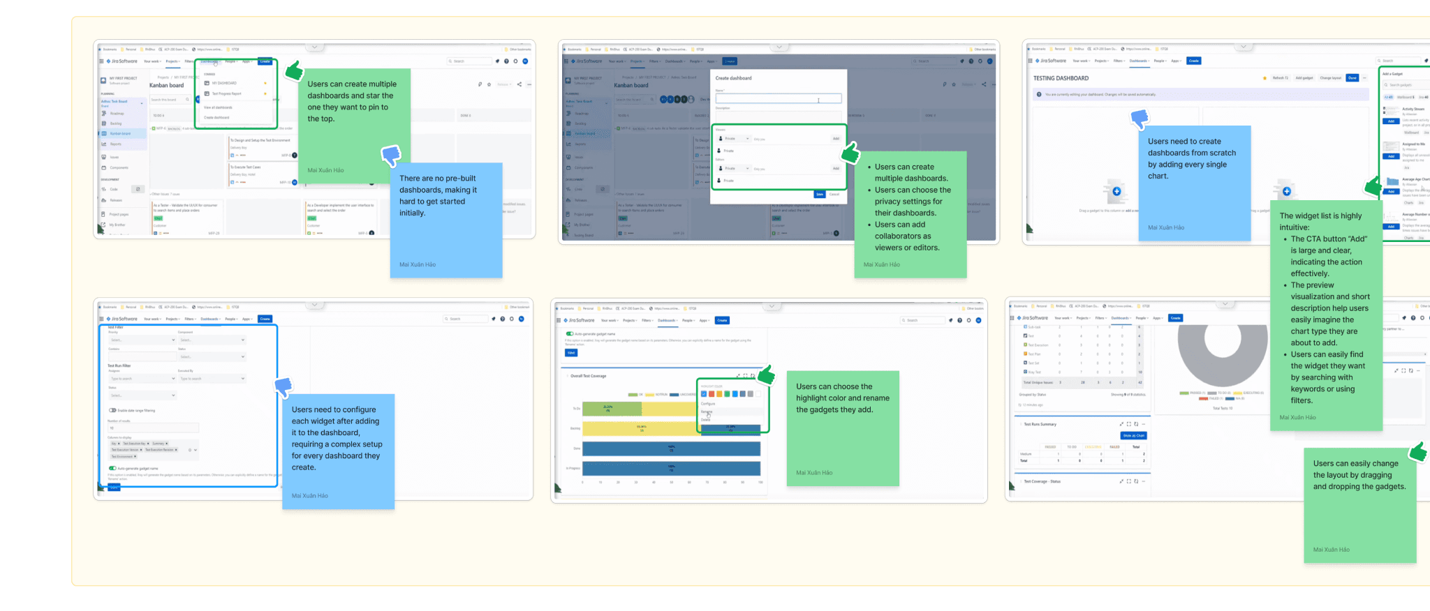
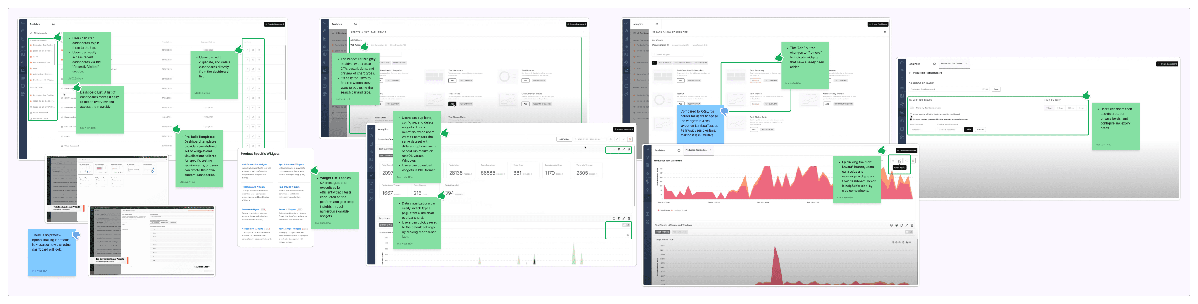
Affinity Diagram
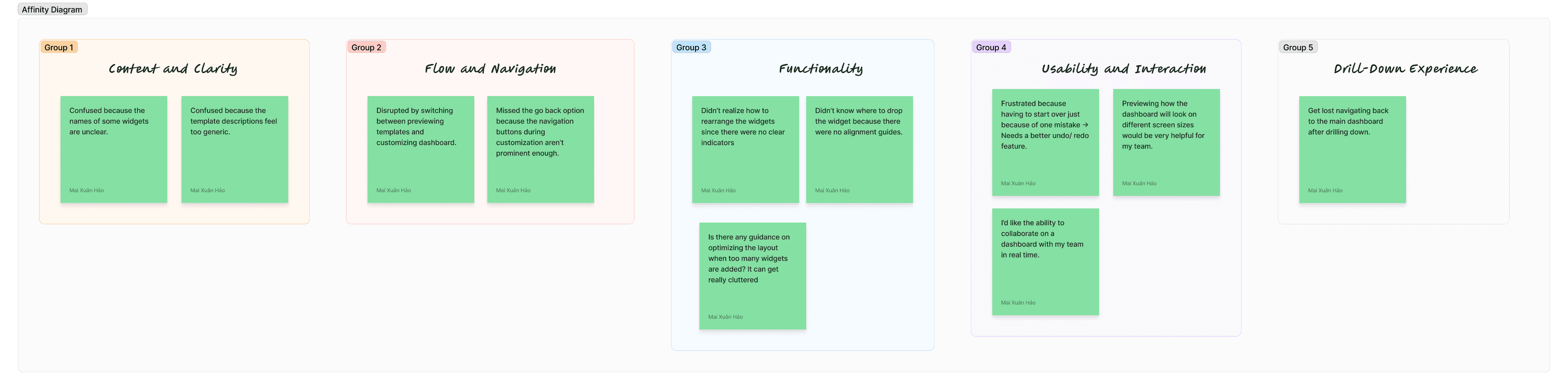
The data I gathered during the Competitor Analysis session feels quite chaotic, doesn’t it?
To make sense of the large volume of mixed insights, I used the Affinity Diagram technique to categorize them into groups based on their relationships.
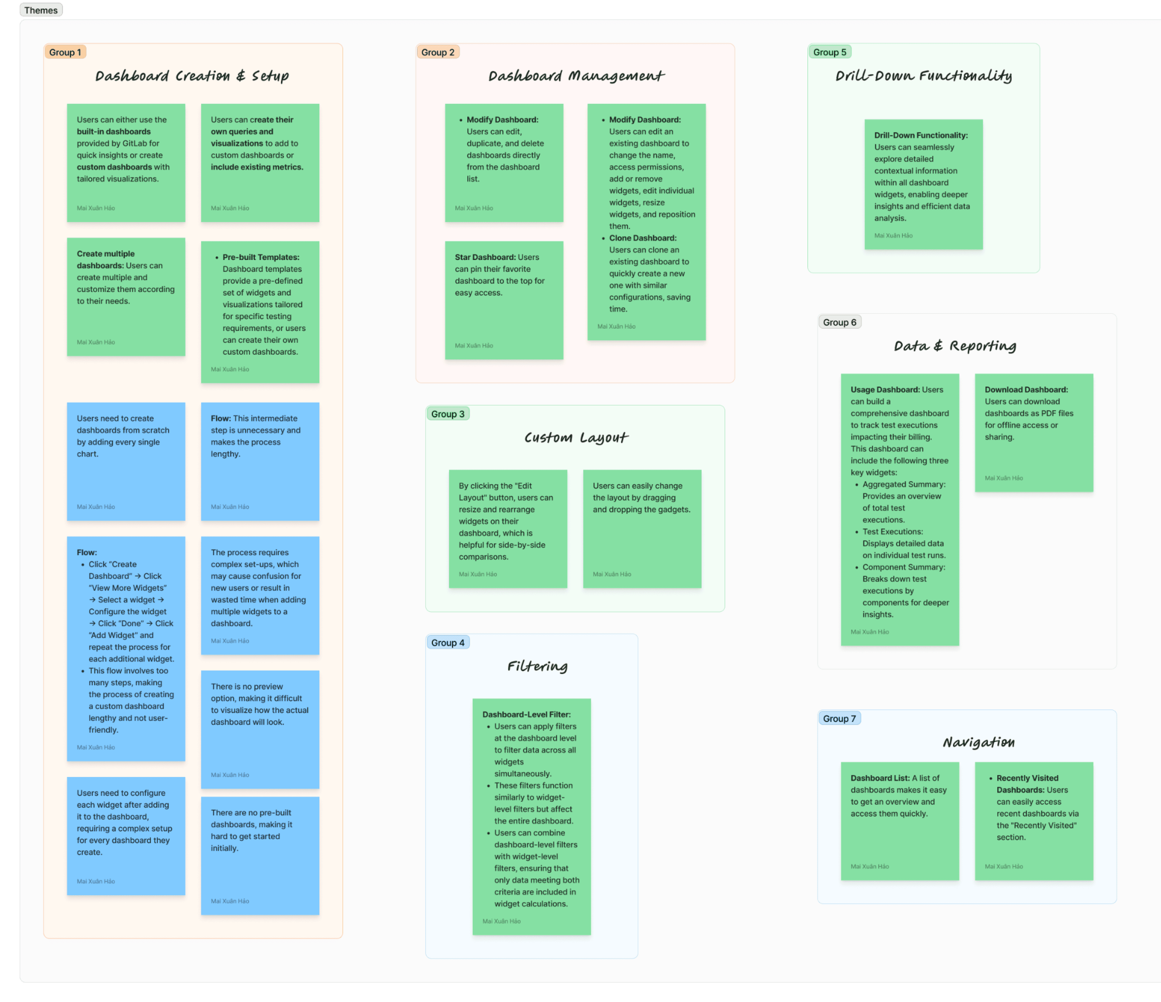
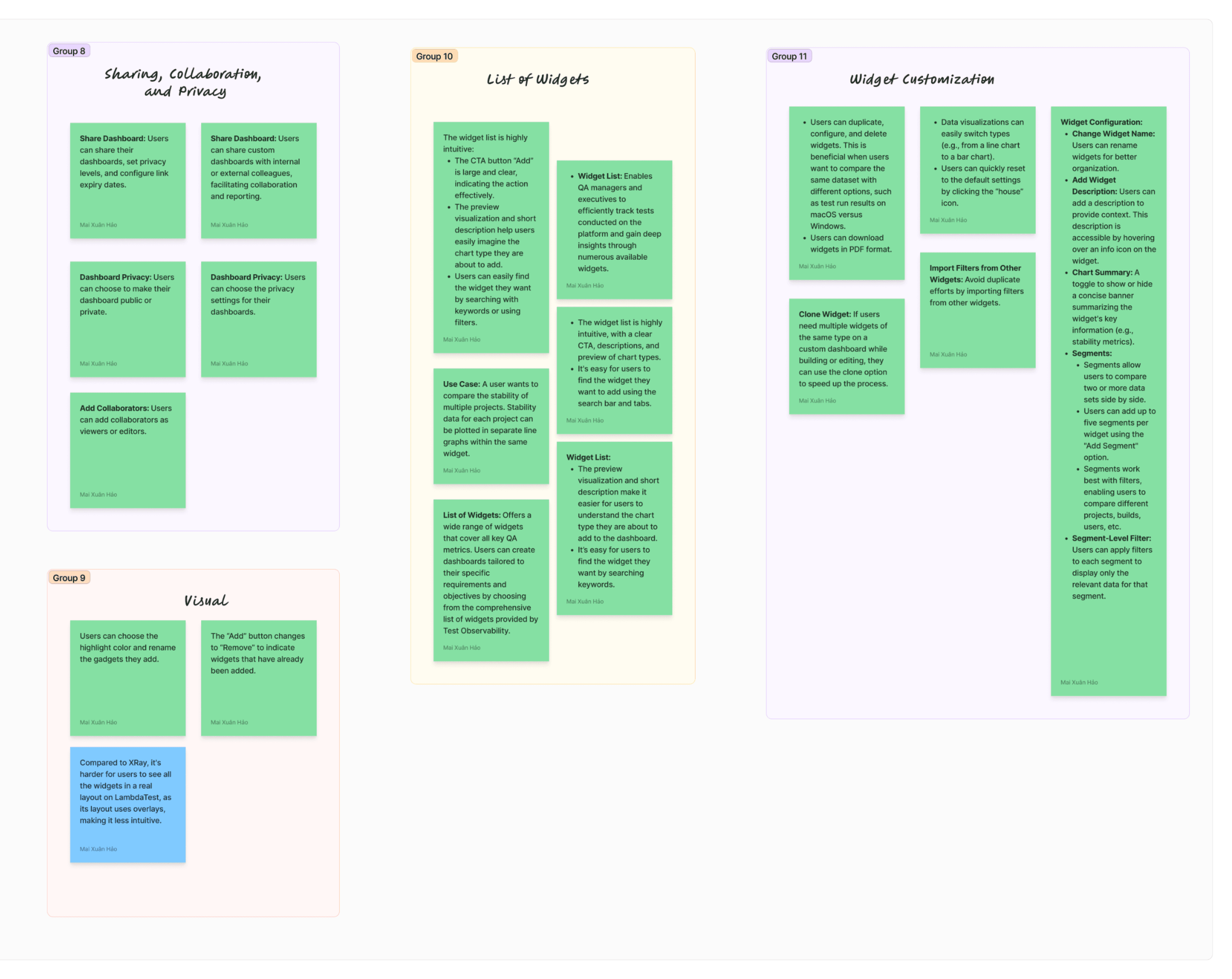
Gaps
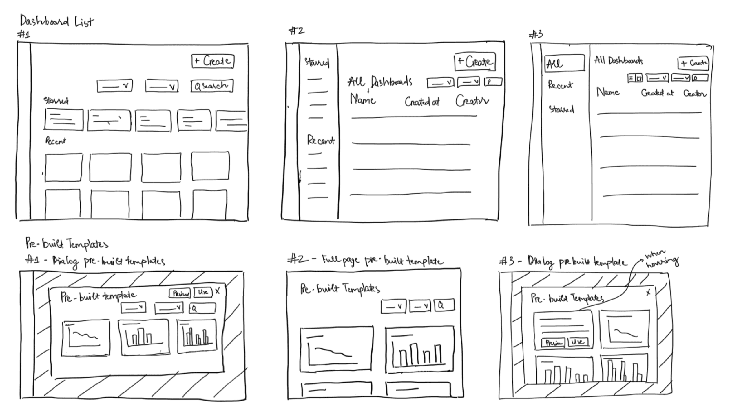
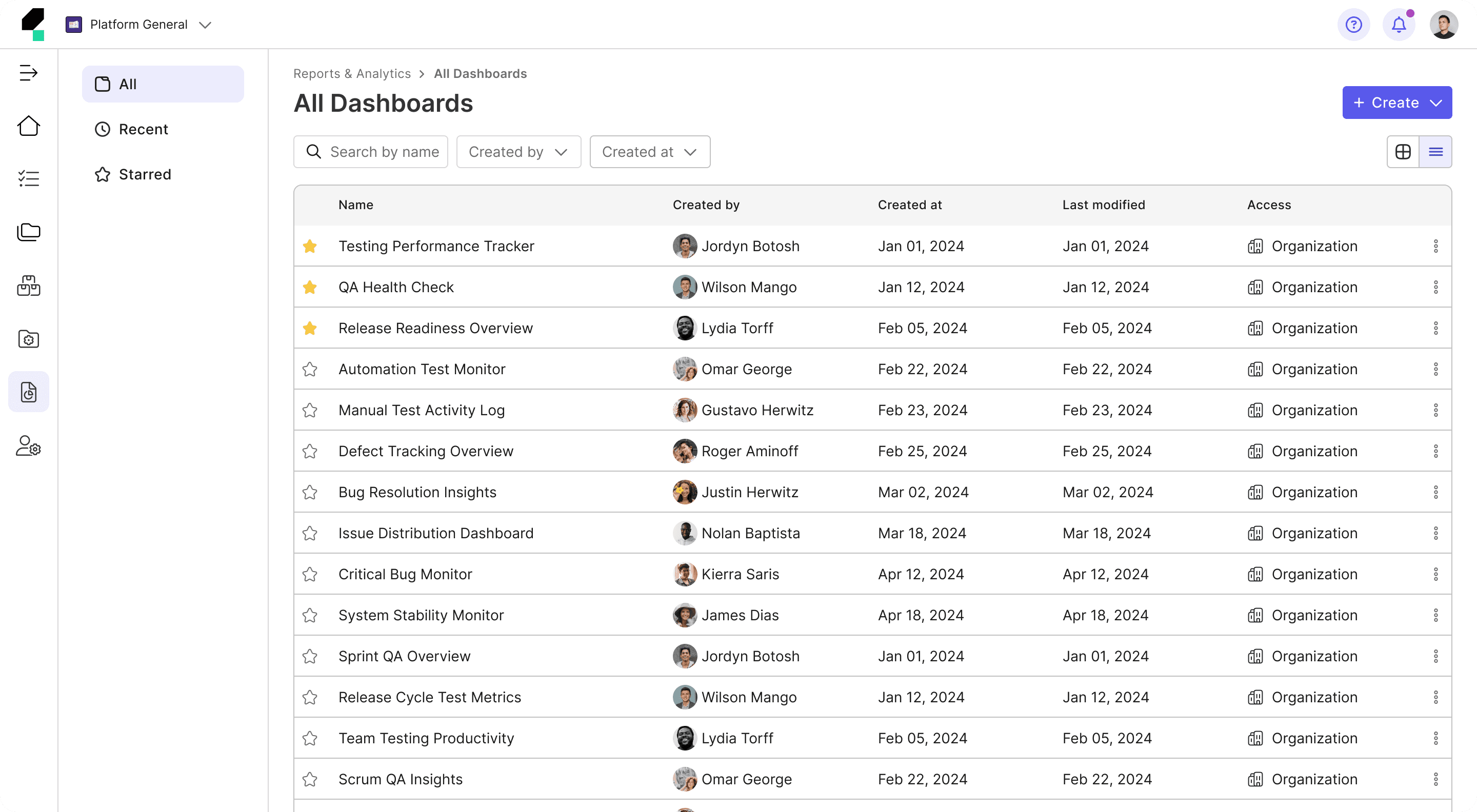
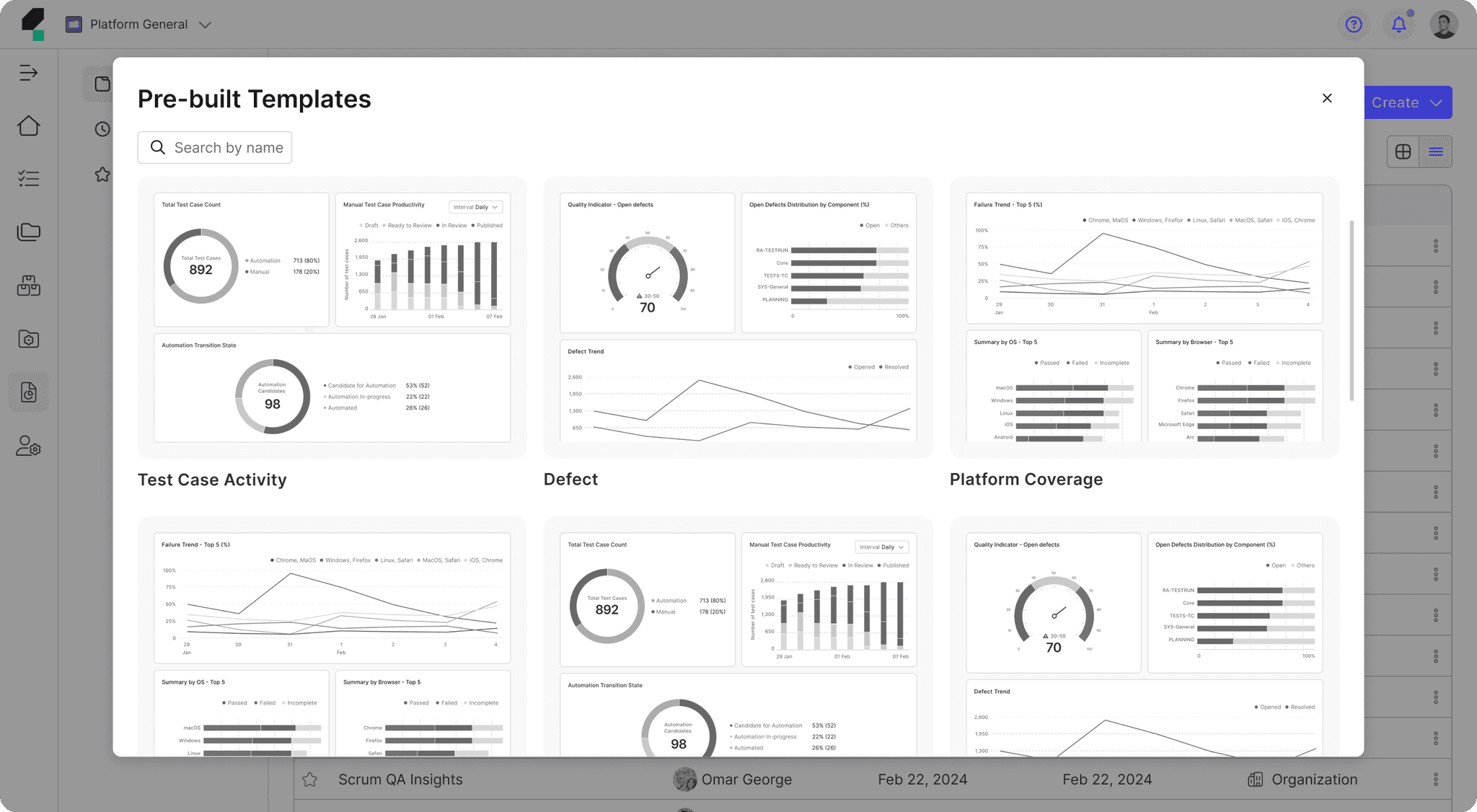
• Lack of Pre-Built Dashboards: Users are left to start from scratch, which can be overwhelming for new users or those who need quick insights.
• Lack of Preview Dashboards Option: Users cannot view widgets in a real layout during the customization process, making it hard to visualize how everything will look together.
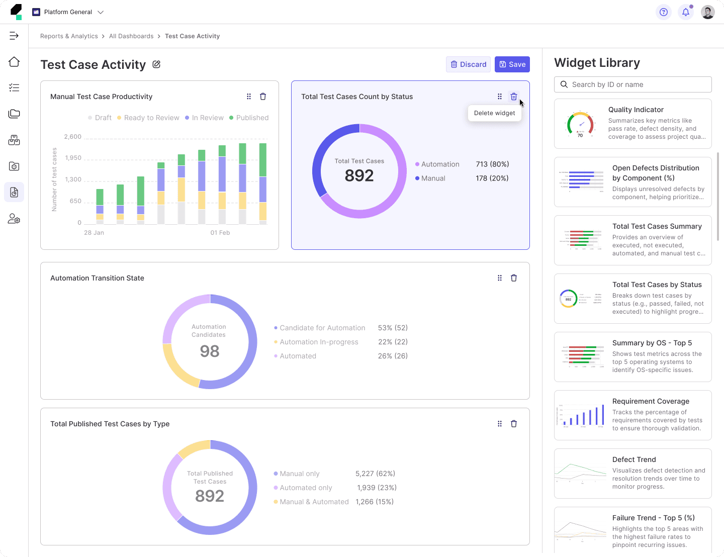
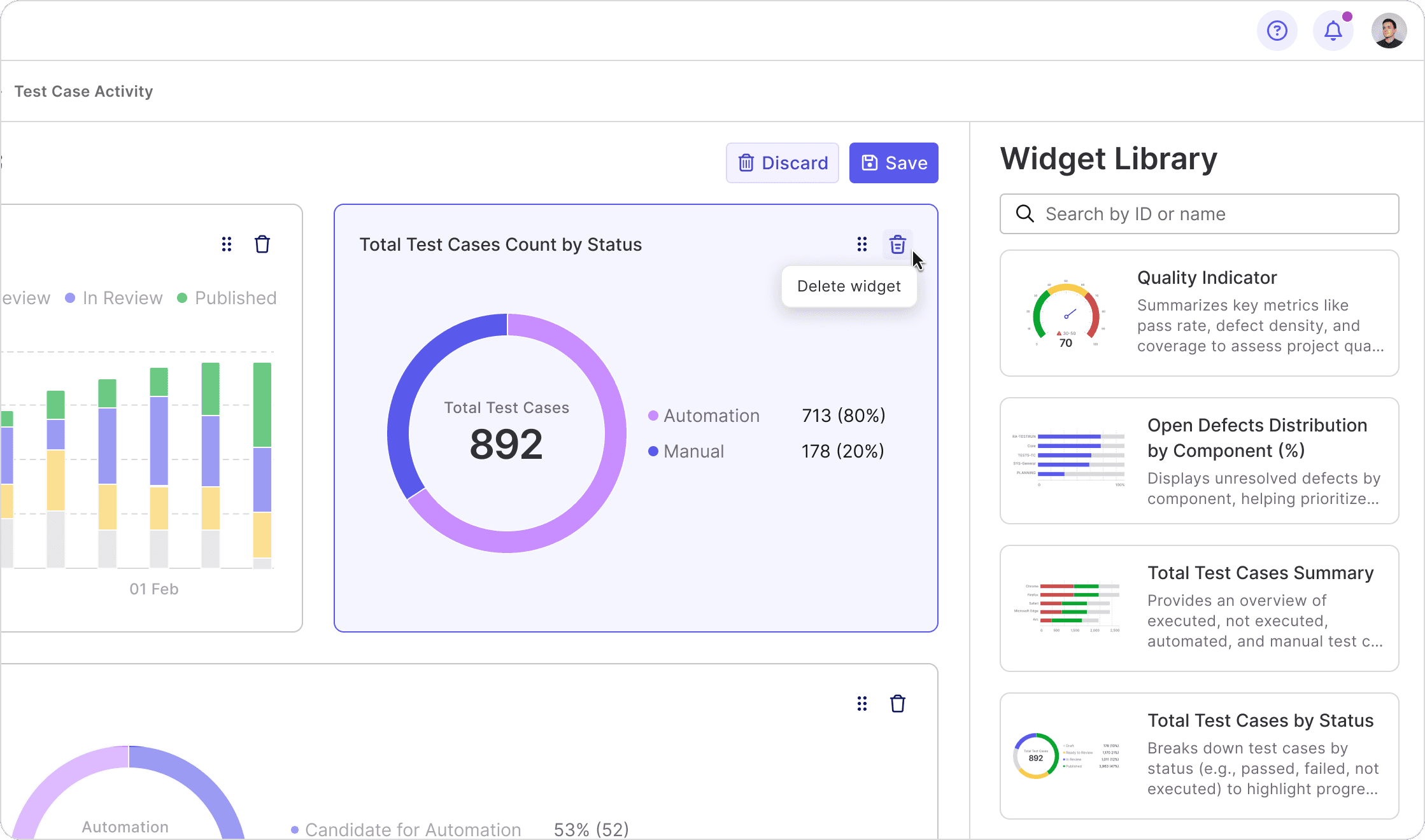
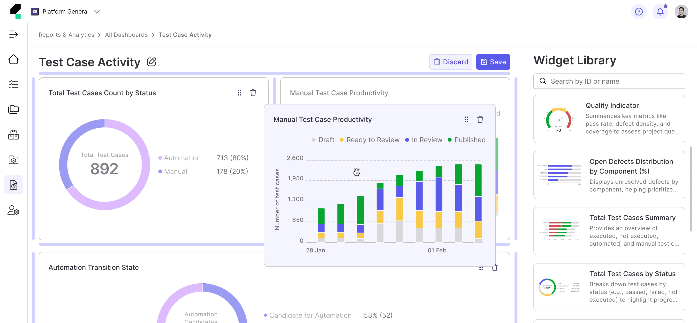
• Complex Widget Configuration: Users are required to configure each widget individually after adding it to the dashboard, leading to a time-consuming and complex setup process.
• Complicated Dashboard Creation Flow: The current flow to create and customize dashboards requires too many steps, making it lengthy and potentially frustrating for users.
• Limited Search and Filter Functionality: Although users can search for widgets, the filtering options could be more intuitive or advanced to handle complex dashboard requirements.
Opportunities
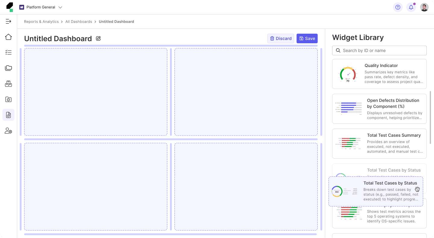
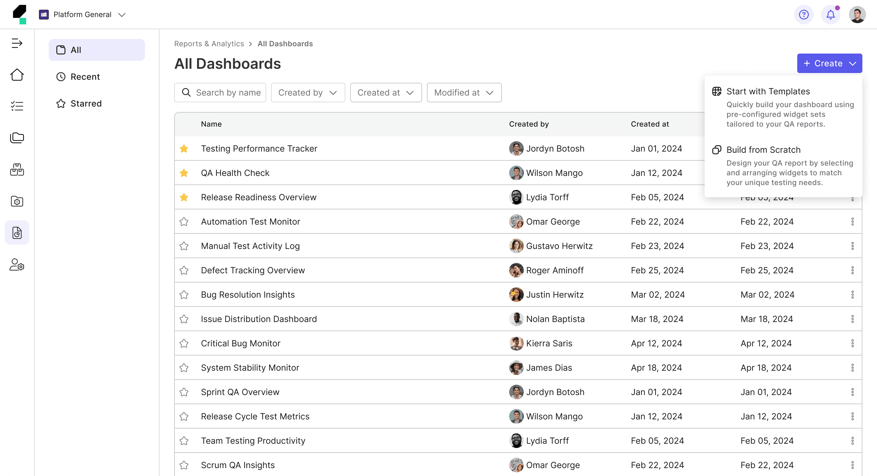
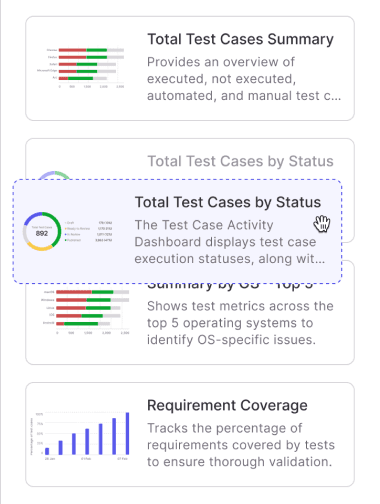
• Pre-Built Templates: Introduce a library of pre-built templates designed for various testing needs (e.g., test executions, stability tracking) that users can either use as-is or customize to fit their requirements.
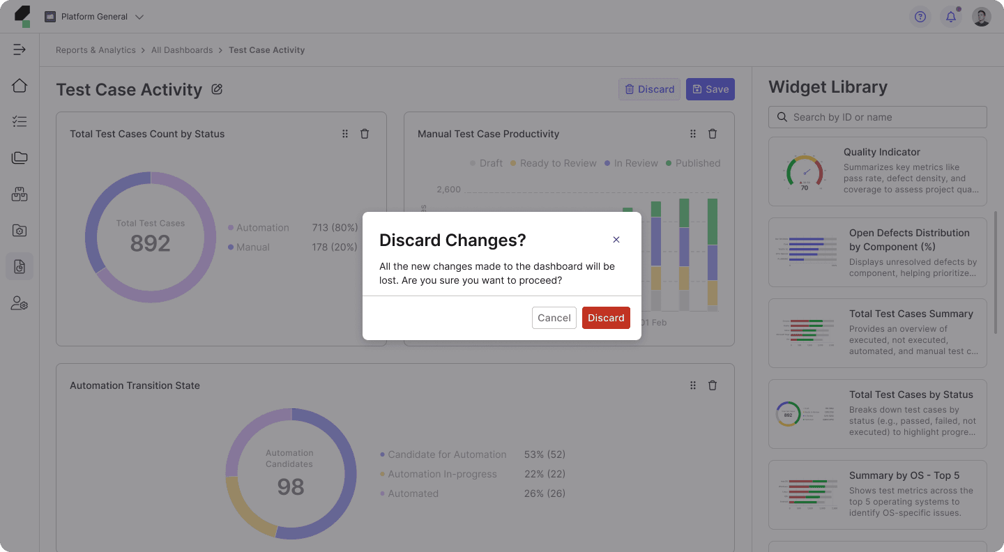
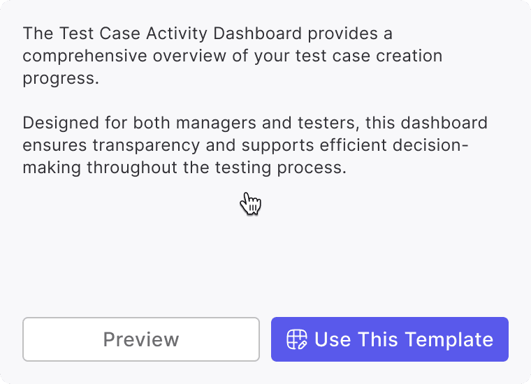
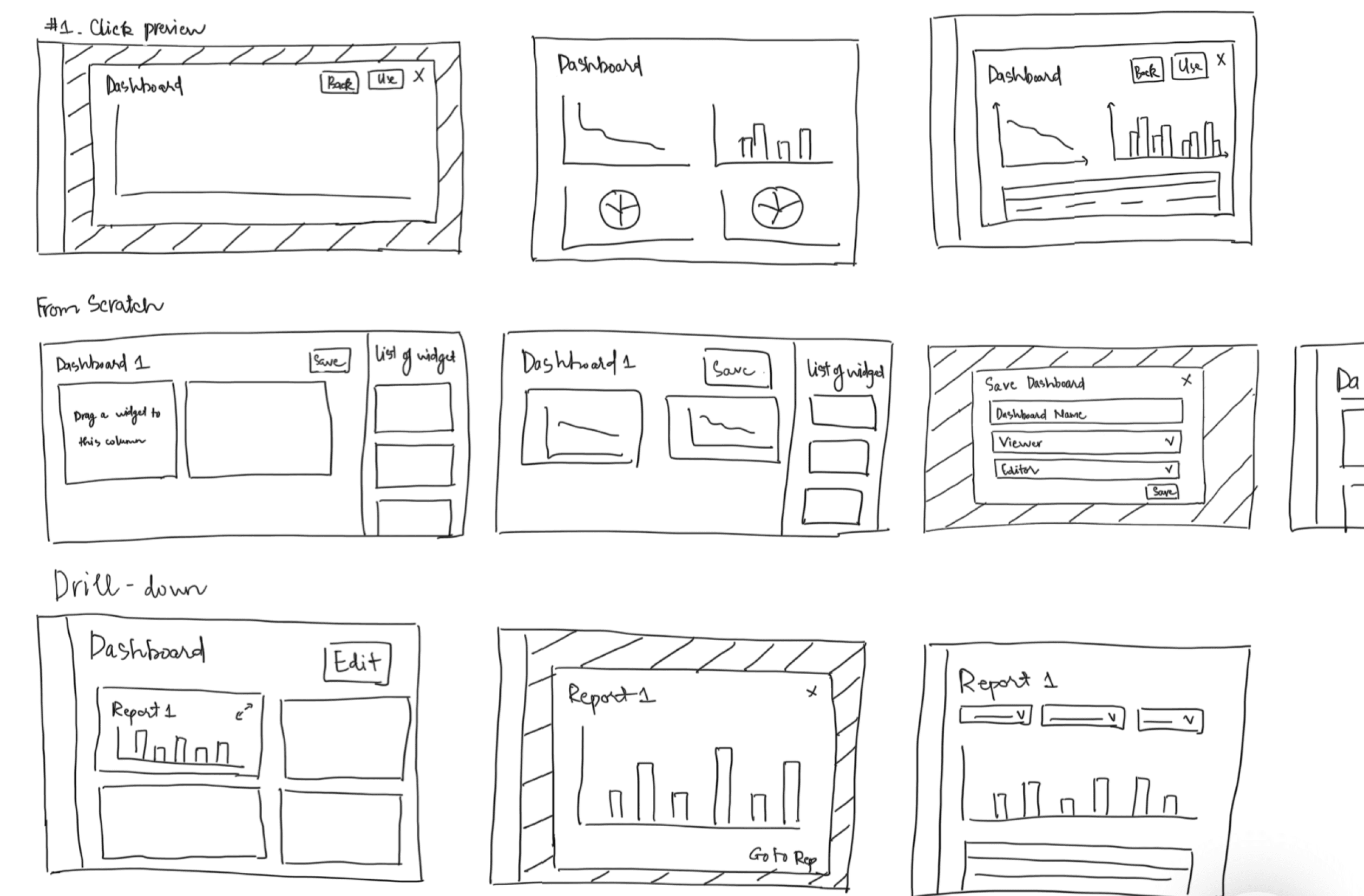
• Preview Dashboards Option: Allow users to preview their custom dashboards or pre-built templates before finalizing them.
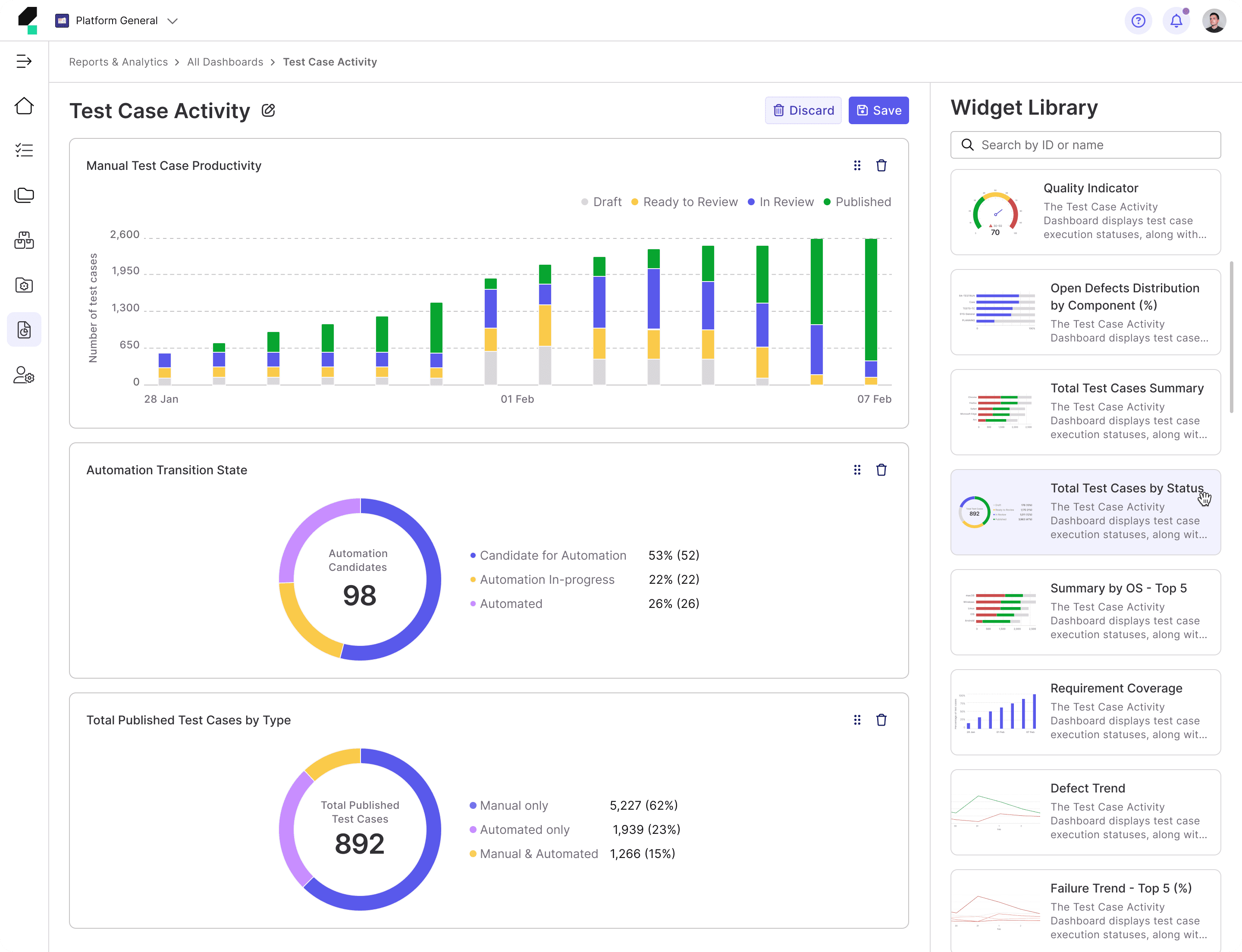
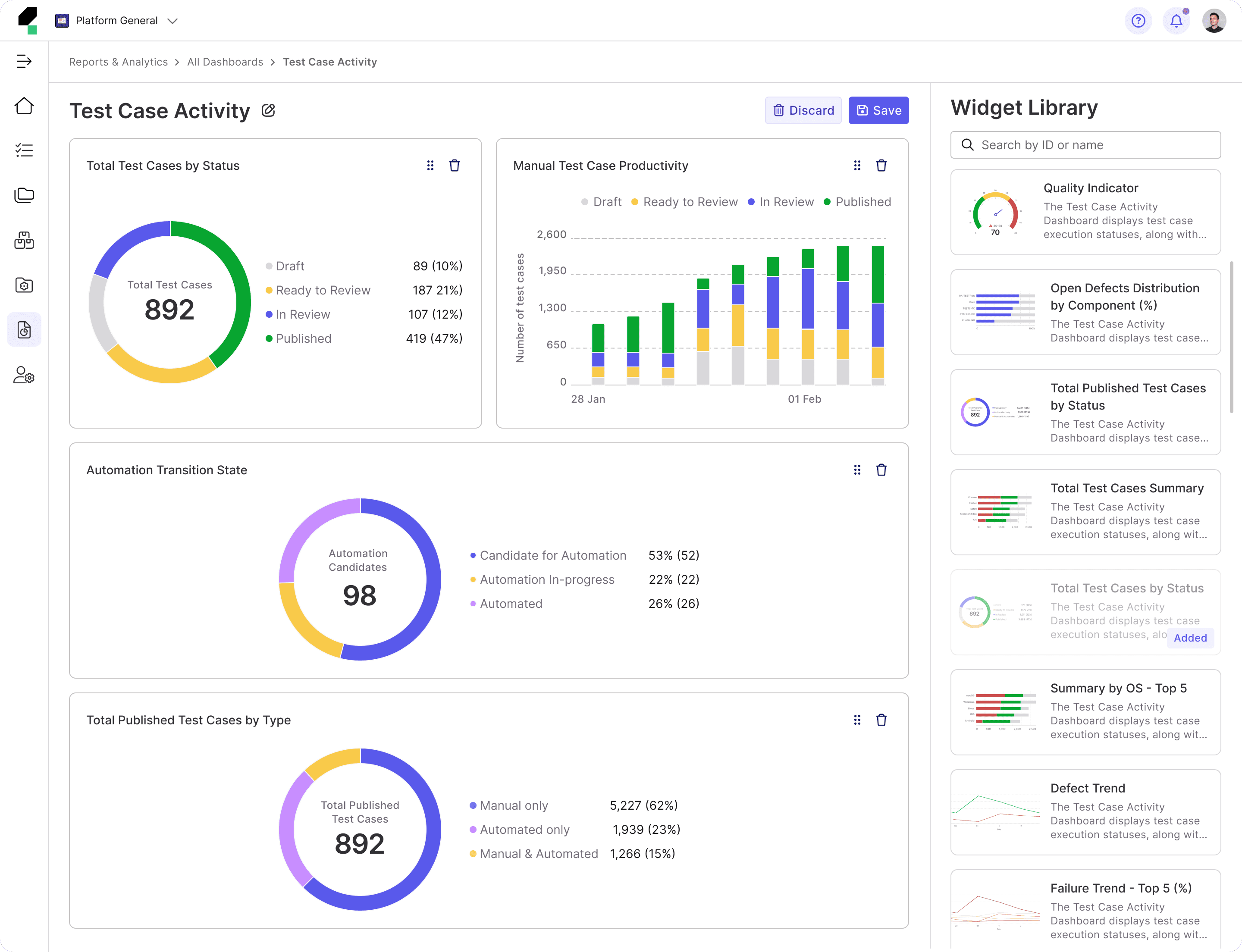
• Simplified and Streamlined Widget Setup: Streamline the widget configuration process by offering default configurations and simplified editing options.
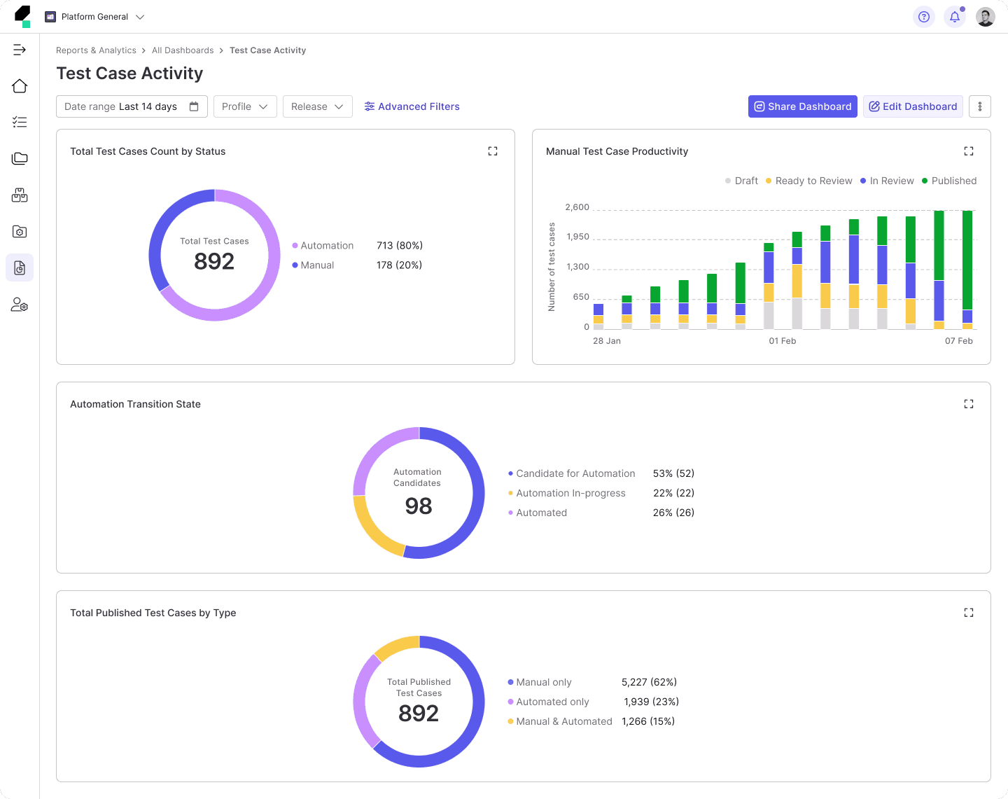
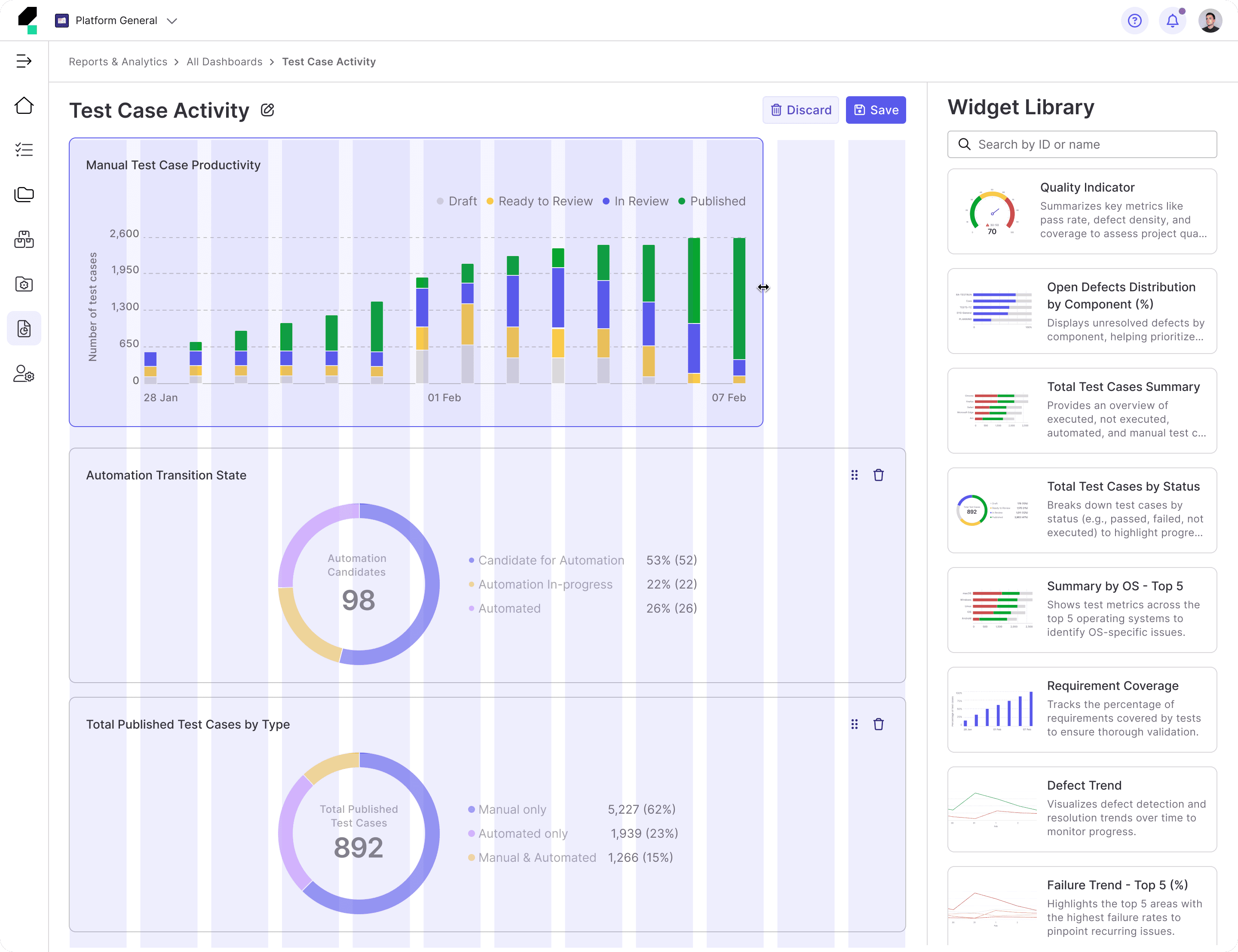
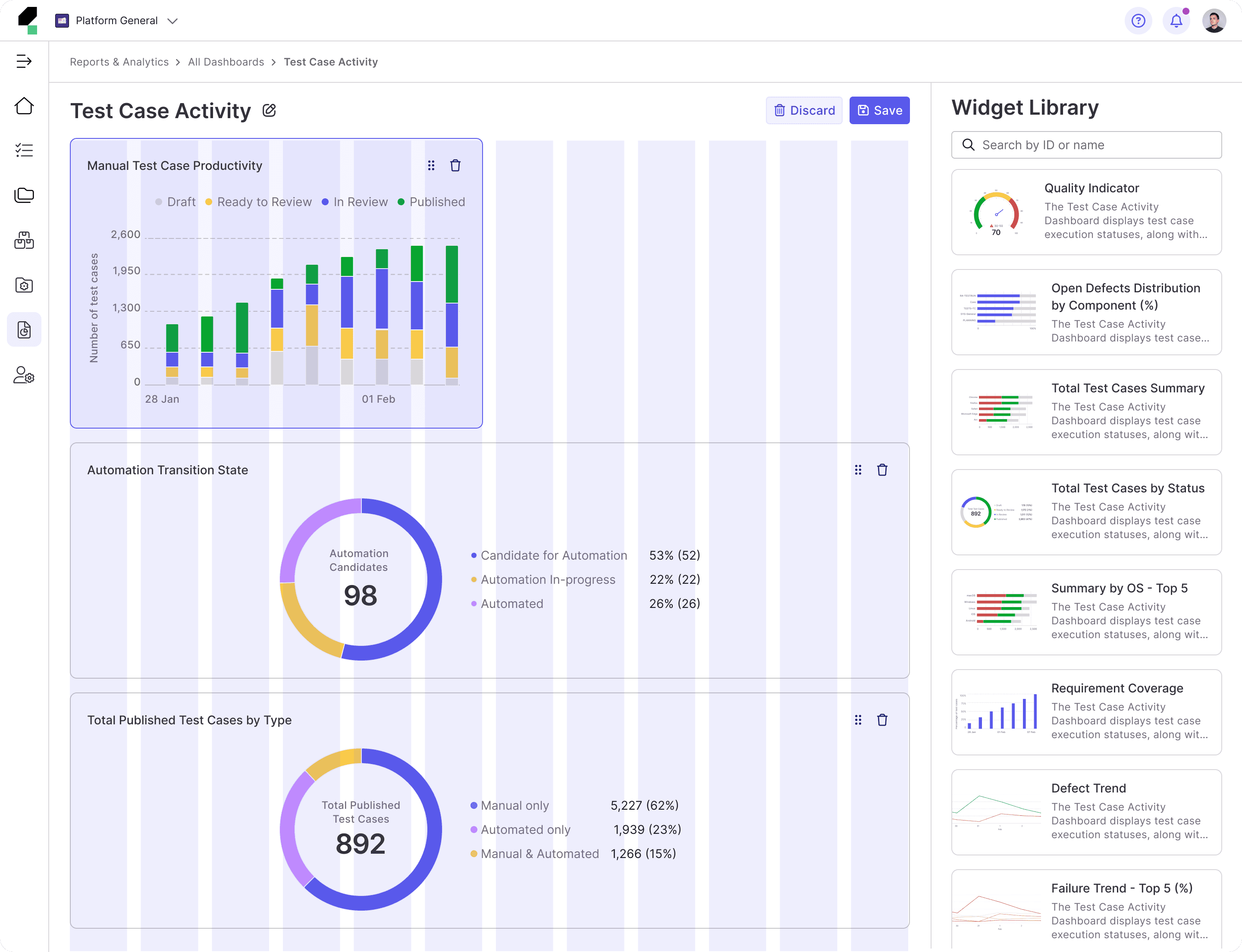
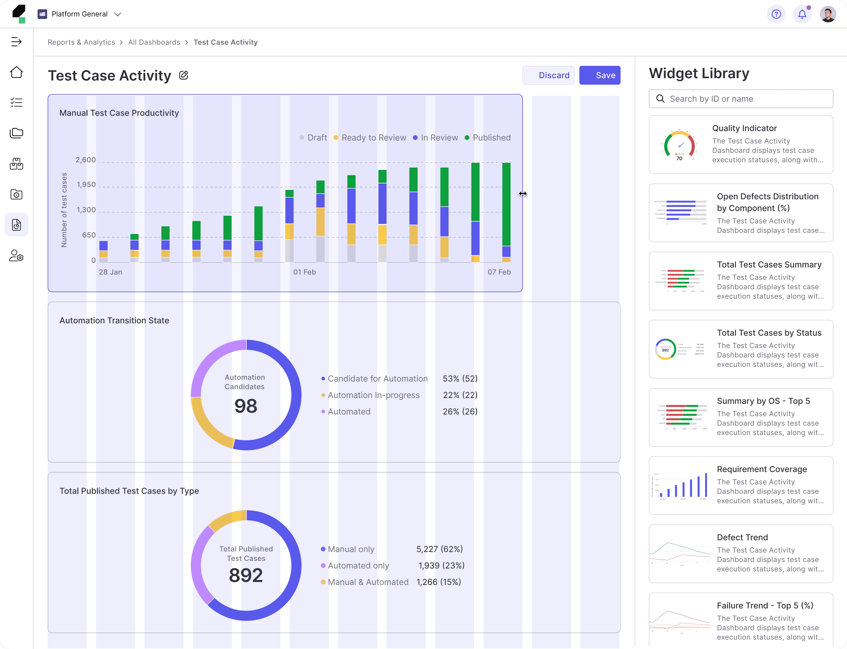
• Enhanced Dashboard Customization and Flexibility: Offer more flexible customization options, such as drag-and-drop functionality for widgets and easy rearrangement of widget positions to improve user control over dashboard design.
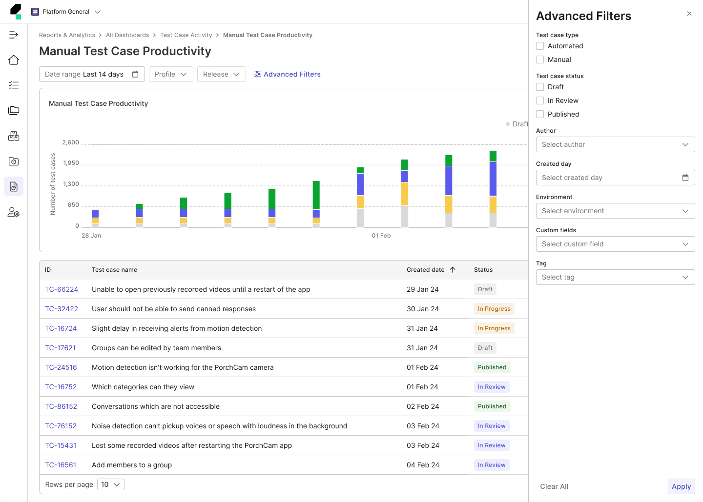
• Filtering: Improve the flexibility of dashboard-level filters by allowing users to apply multiple filters across all widgets at once, enabling a more customized and comprehensive view of the data.
• Visual Consistency and Interaction Improvements: Improve the visual consistency of the platform by aligning widget styles, ensuring that layouts are intuitive and interactive features (e.g., drill-down, filter imports) are clearly accessible to users.
Task Flow & User Flow
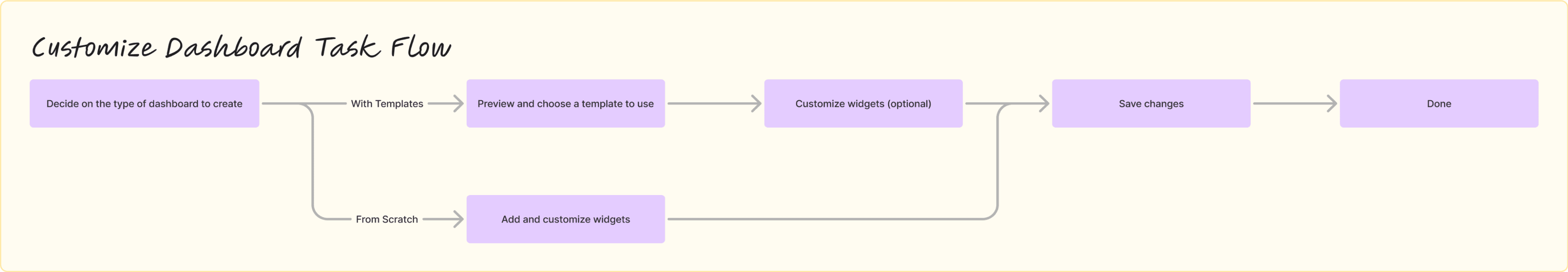
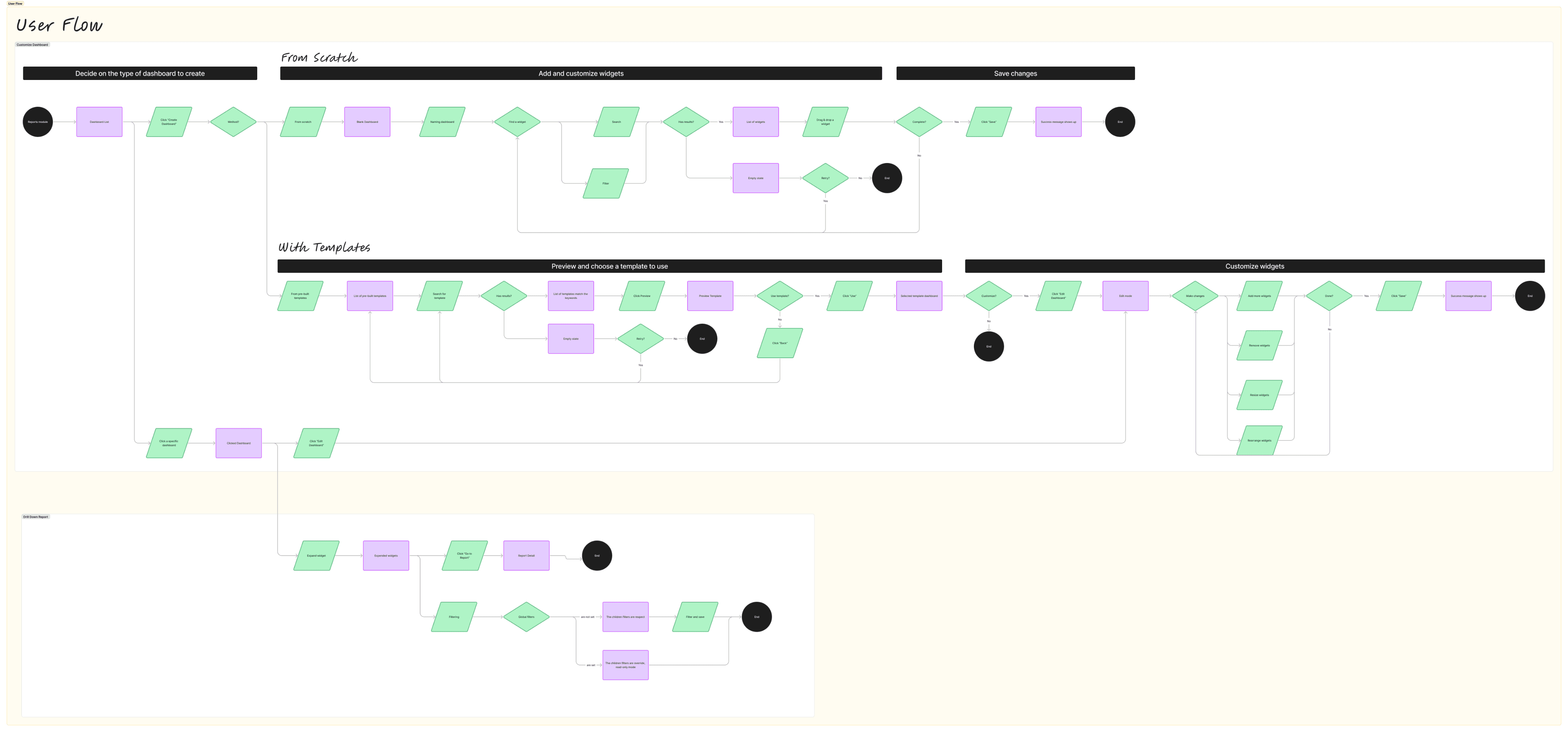
Sketch
I use sketches as a quick, cost-effective method to explore design concepts and align with Product Managers before investing time and resources into more detailed wireframe. By sketching the structure and layout of design solutions, I can efficiently explore multiple variations to identify the most optimal layouts. This process also helps ensure the navigation is logical and intuitive for users.
Wireframe
Next, I create low-fidelity wireframes with added details, including navigation, to demonstrate how experimental design solutions would flow and function for target users.
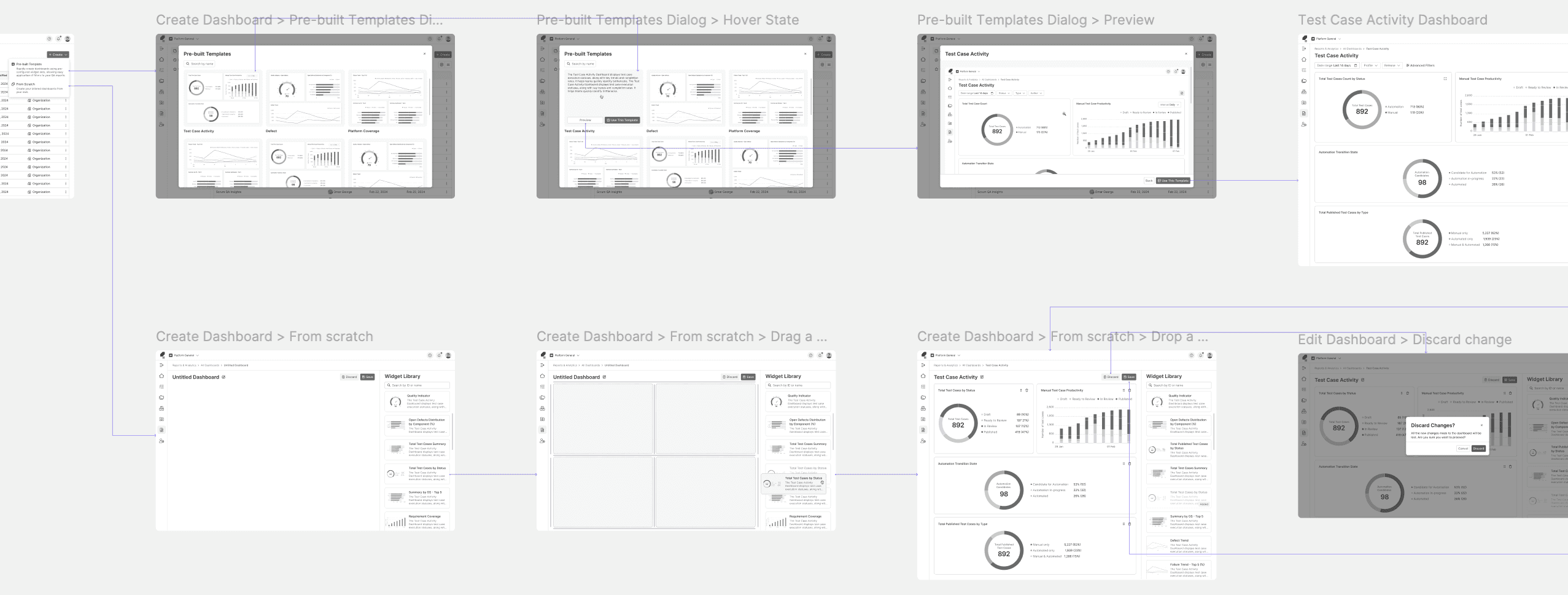
I often include annotations to clarify functionality, behavior, and design rationale, making it easier for Engineers, and Product Managers to understand the wireframes.
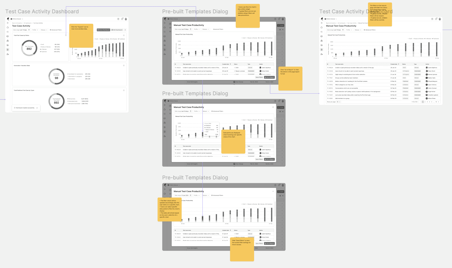

Test and Refine
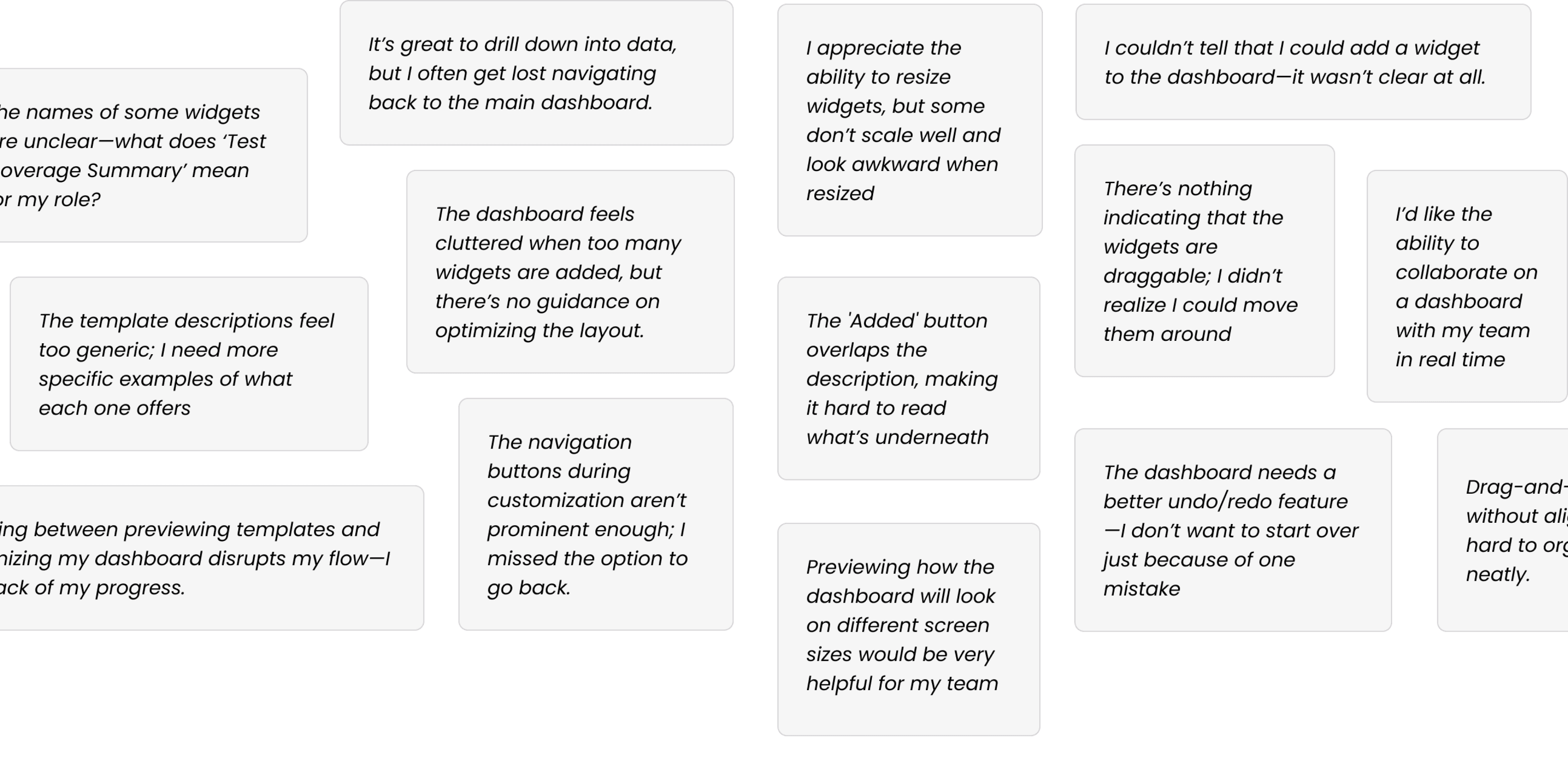
I review low-fidelity wireframes with engineers to evaluate technical feasibility and conduct usability testing with internal users, including QE Leads and QEs, to ensure the solutions effectively address user pain points.
Two rounds of usability testing were conducted: the first provided insights that informed the transition from wireframes to mockups, while the second identified areas in the mockups that required further improvement.
Following the studies, I categorized the feedback into groups based on themes to facilitate a more focused analysis and guide the next steps for refinement.
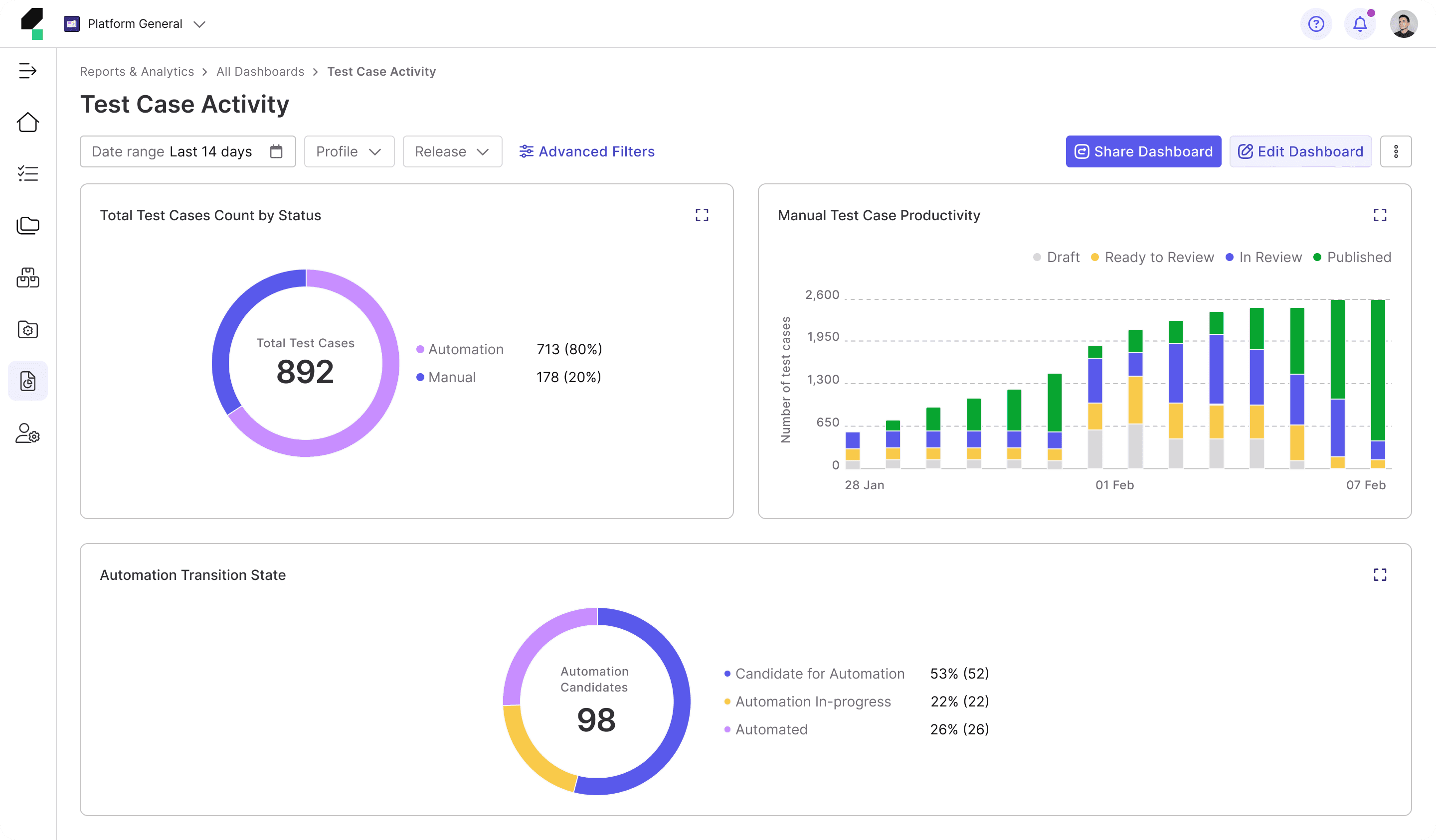
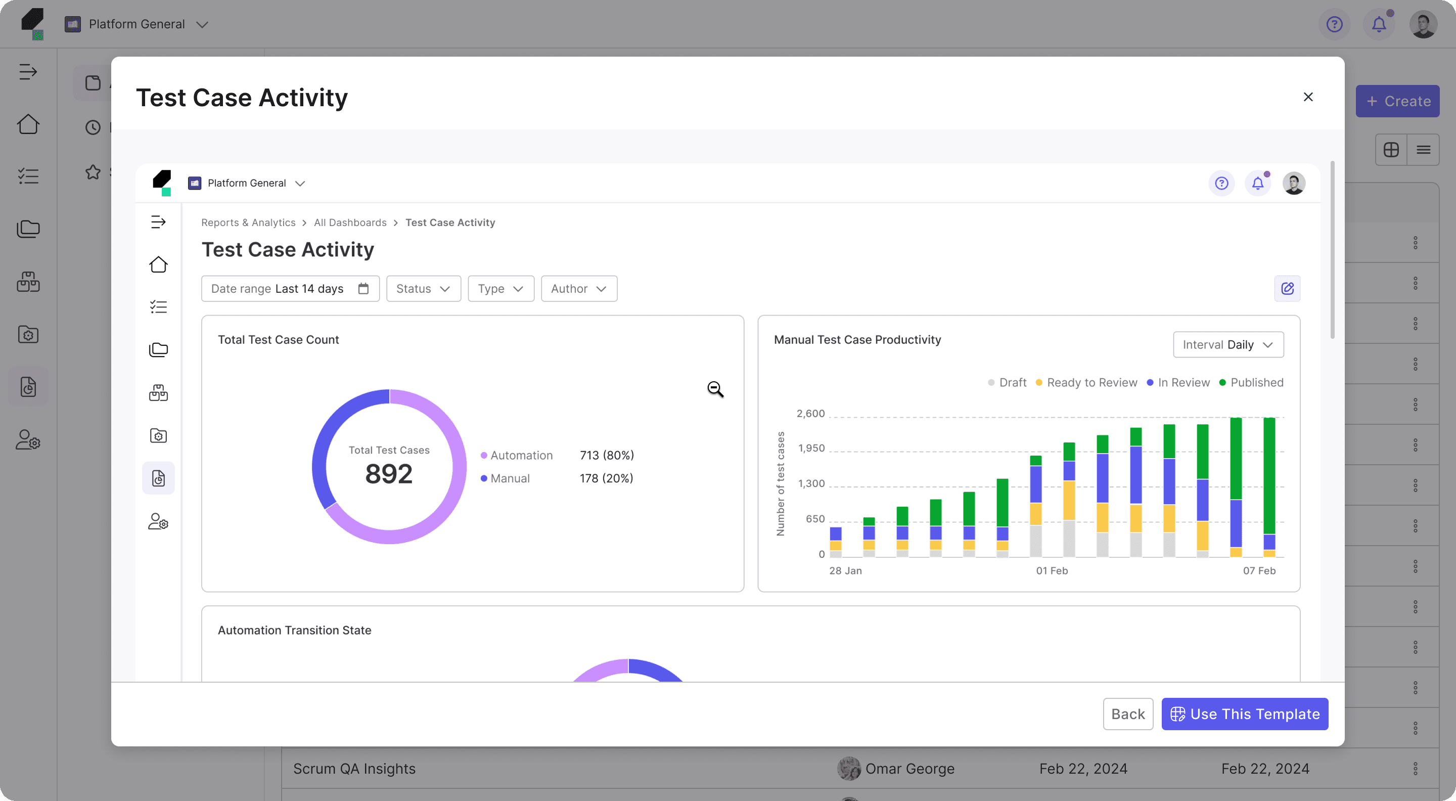
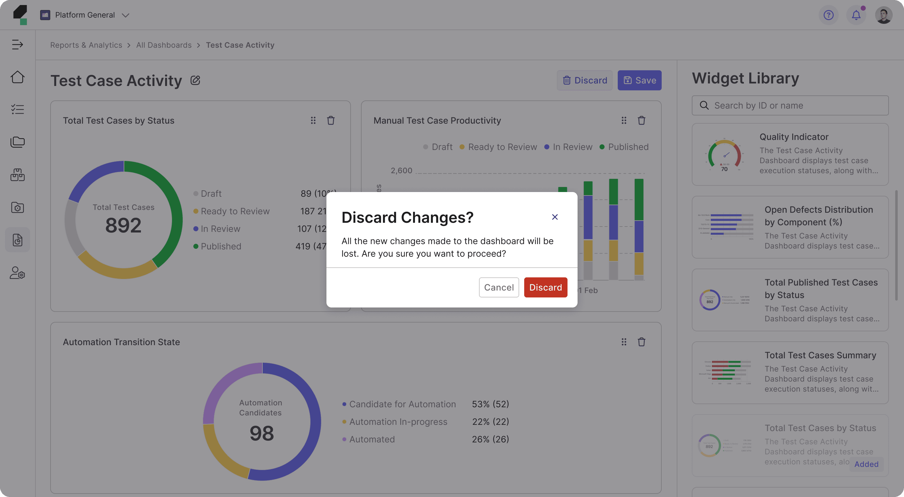
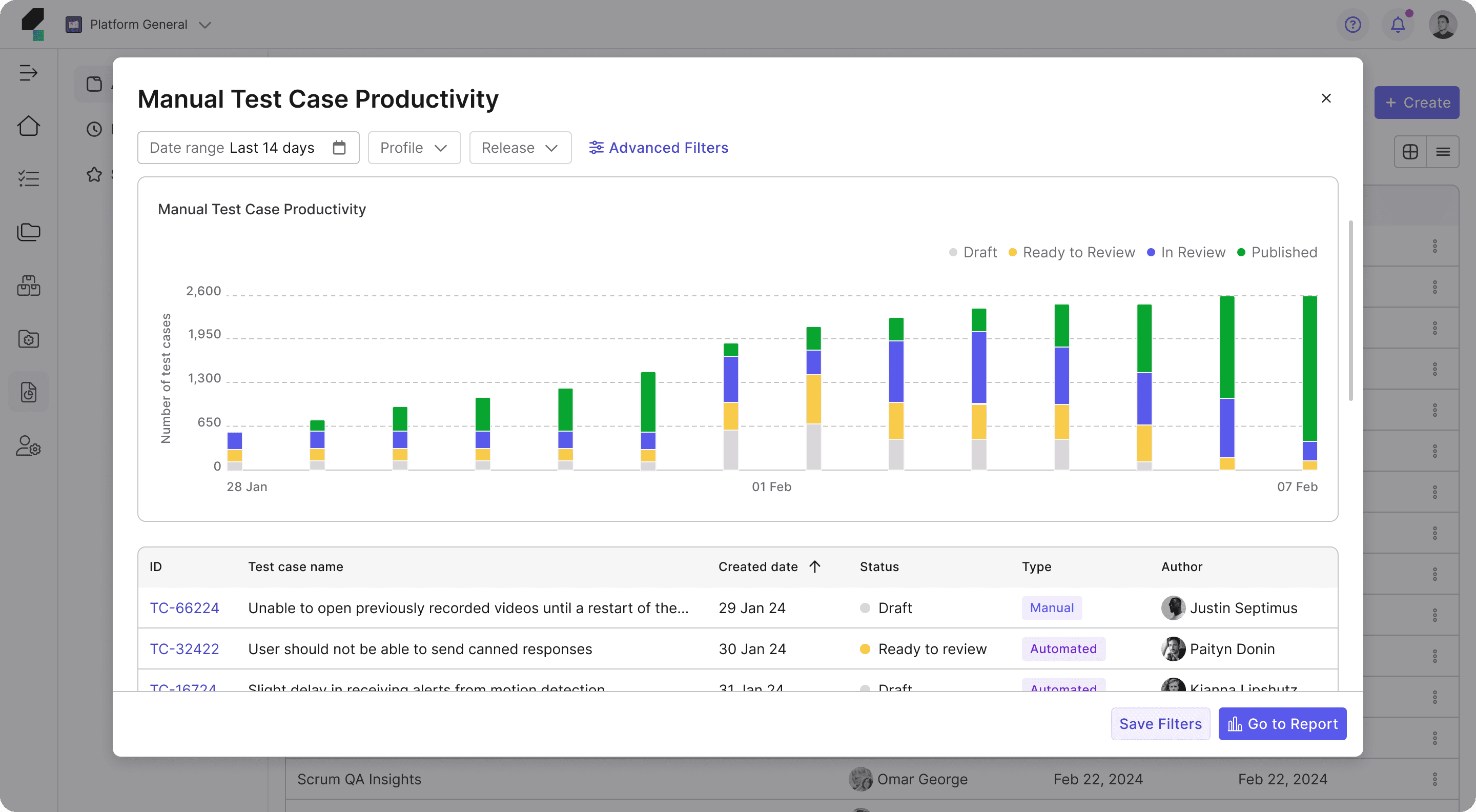
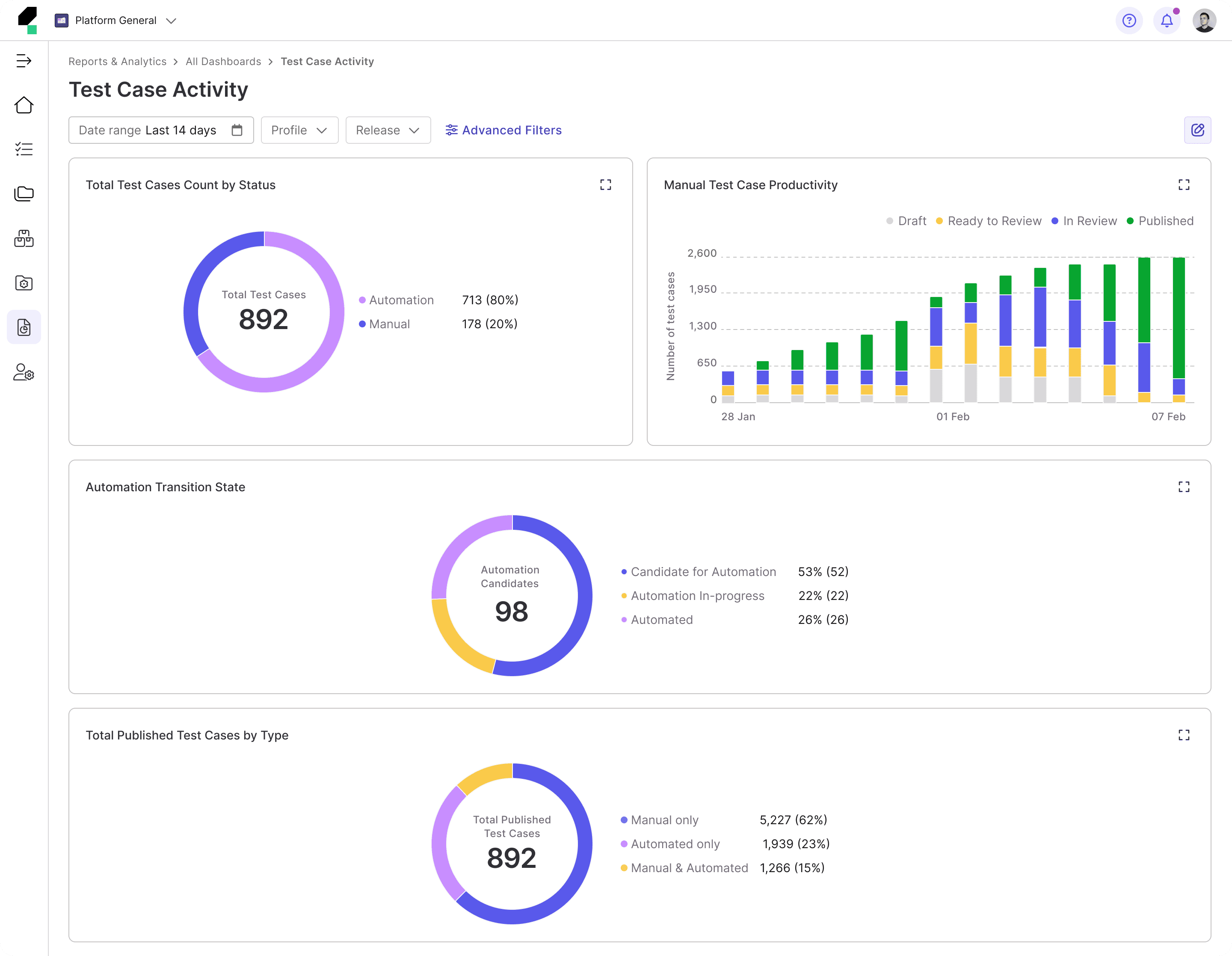
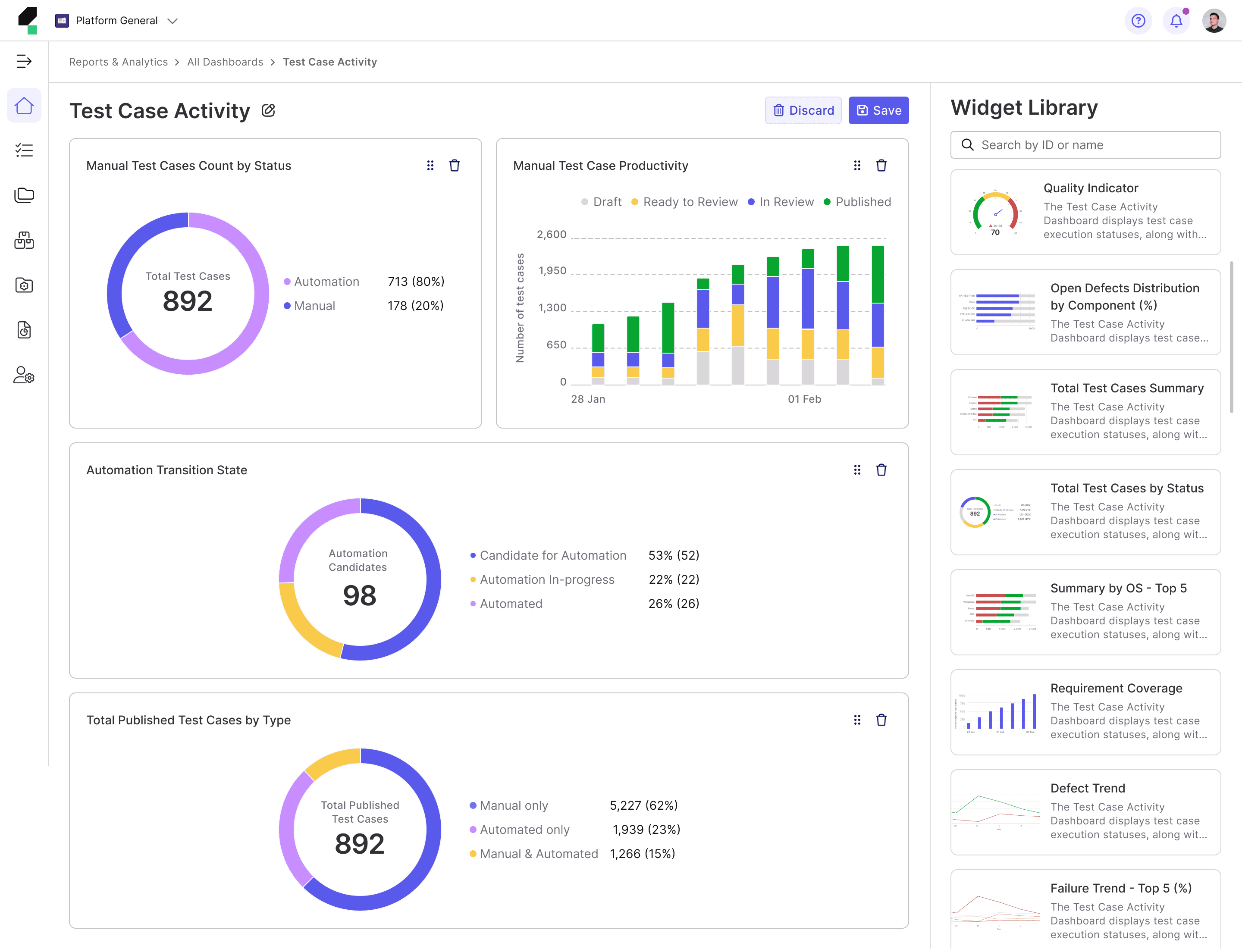
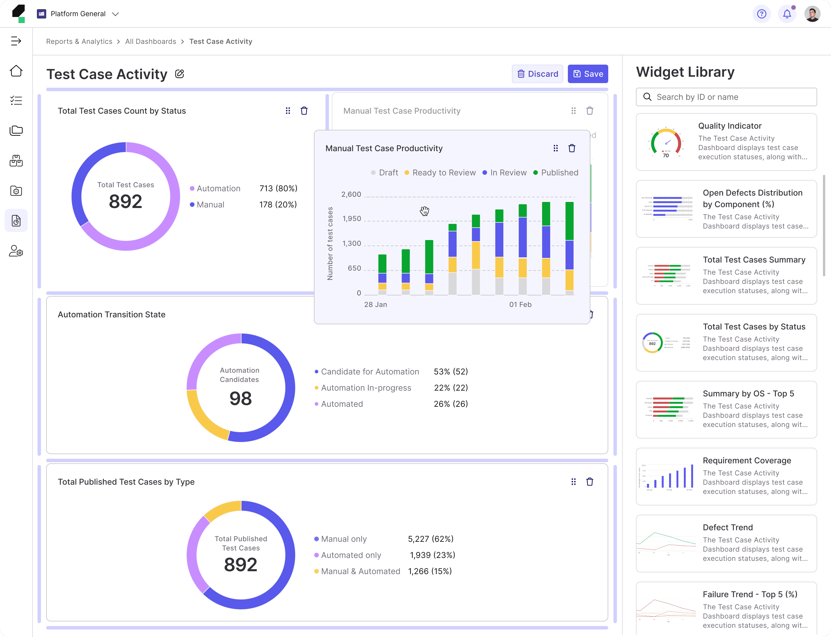
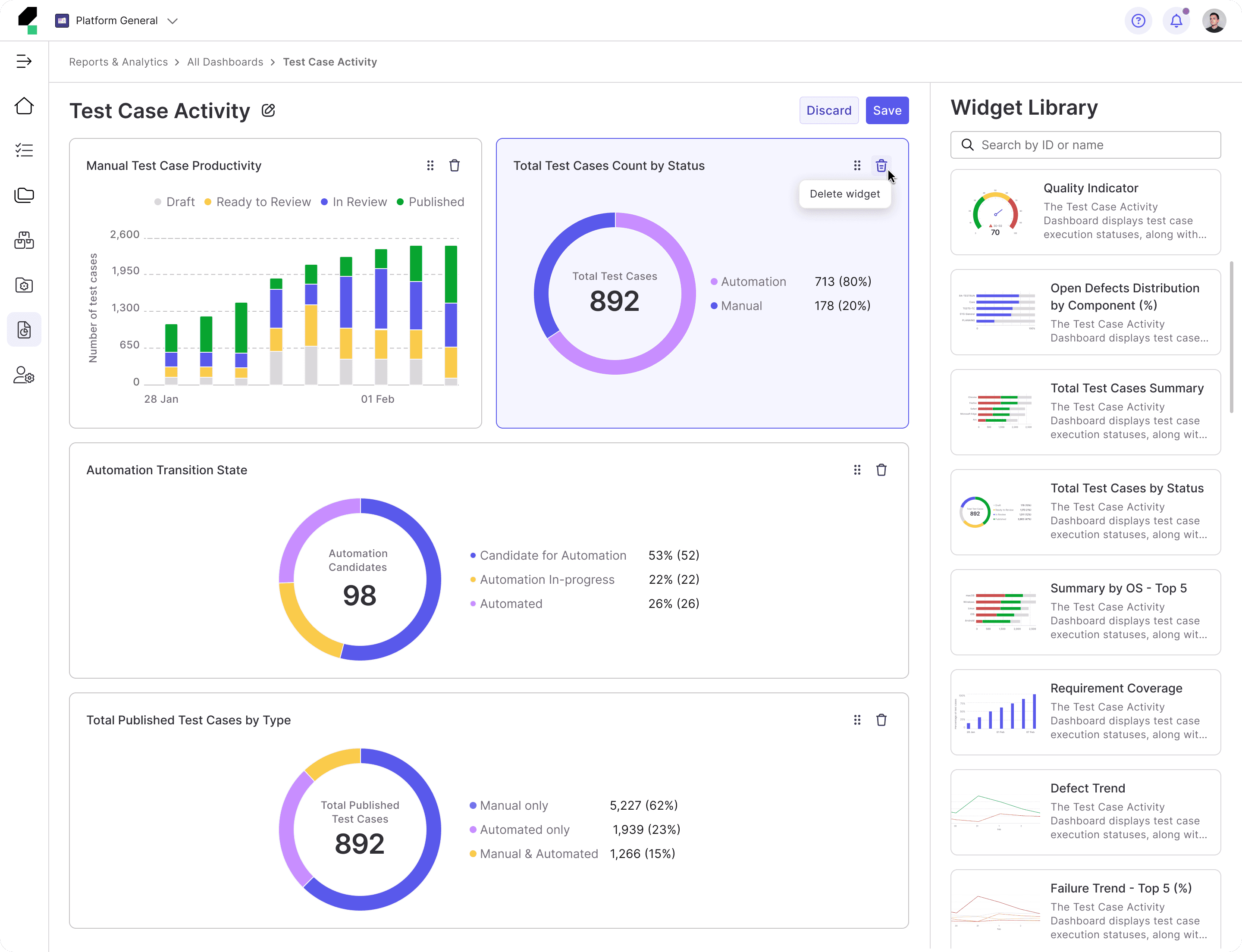
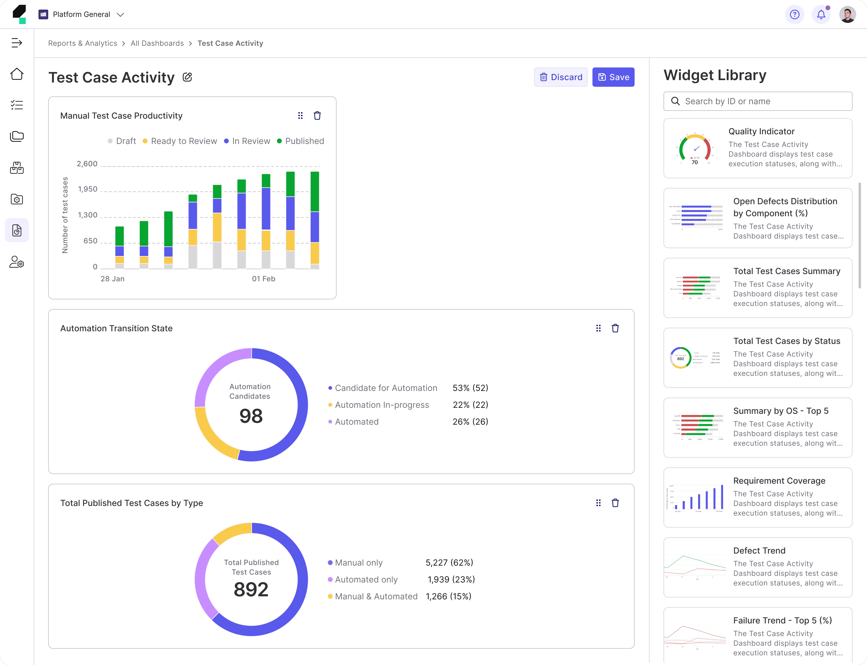
Final Design

Reflection
This project was a valuable learning experience, especially in dashboard interaction design and creating user-friendly customization. Working under a tight deadline pushed me to make design decisions efficiently, though it left little room for in-depth user research. Since usability testing took place after my departure, I couldn’t analyze real user feedback, which would have provided deeper insights. Despite these challenges, I gained a stronger understanding of designing scalable and flexible dashboards, reinforcing the importance of balancing customization with ease of use in enterprise products.